
Danni Whittaker.

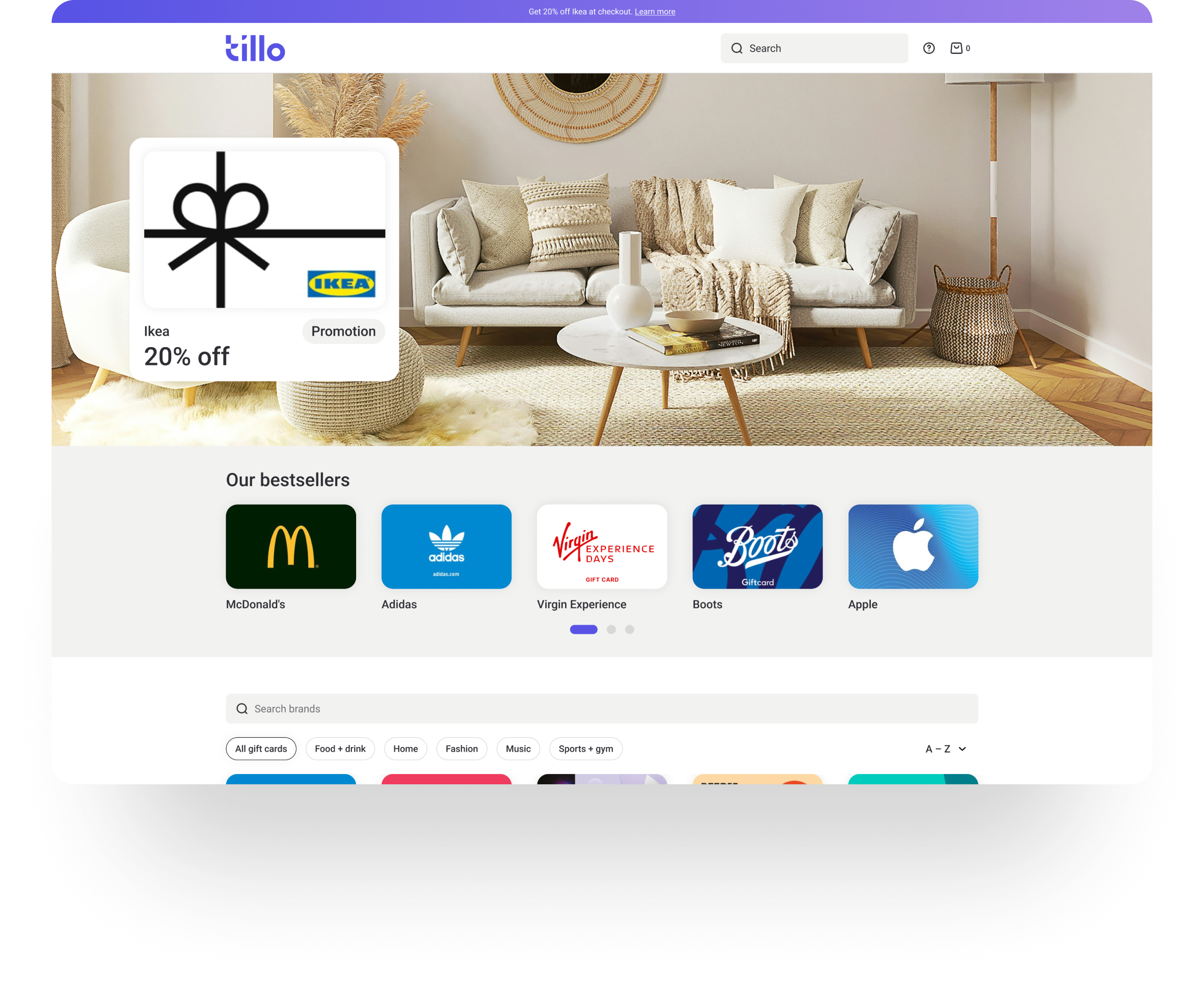

White-label gift card platform
Designed a repeatable white-label gift card mall that removed time-to-market barriers for B2B clients and generated £800k+ in revenue.
Project overview
Problem statement
Prospective B2B clients wanted to resell Tillo gift cards, but building and maintaining an e-commerce platform from scratch was a blocker. The effort, cost, and time involved meant deals were being lost despite clear demand.
Mission
The aim was to create a white-label solution that clients could launch quickly, brand with minimal effort, and trust to work out of the box for end customers.
My role
I owned the UX and UI end to end, from defining the MVP scope and mapping user journeys through to visual design, validation, and handover. I worked closely with Product and Engineering to align on feasibility and timelines, and presented the solution directly to a major B2B client to secure rollout approval.
Company
Tillo is a global platform that connects businesses with retailers, making it easy to buy, sell, and distribute digital gift cards.
Tools
FigJam, Figma, Miro

Impact
Profitable
Tillo have made over £800k+ since launch.
£1M+
Generated revenue for Tillo clients.
Market expansion
Enabled Tillo to win key B2B clients in the US and Canada, accelerating international growth.
Scalable
The white-label platform can be deployed for multiple clients without re-building infrastructure, saving time and resources.
Competitive
Differentiates Tillo from competitors by offering a ready-to-go, customisable solution.
15 sites launched
Clients include leading cashback, discount, and points brands in the UK and US.
Discovery
Early conversations with the Sales team revealed a clear pattern behind lost deals. Pricing and features weren’t the issue. The real blocker was implementation effort and speed to market. Clients wanted to start selling gift cards quickly, without designing, building, and supporting a bespoke solution.

The problem in a nutshell
Despite strong demand for gift cards, time and effort to launch were the biggest barriers to adoption.
Defining success
Success meant removing the biggest blocker to adoption: time to launch.

Time
Enable customers to start selling quickly

Scalable
Repeatable solution that could scale across clients

Onboarding
Simple setup and brand customisation
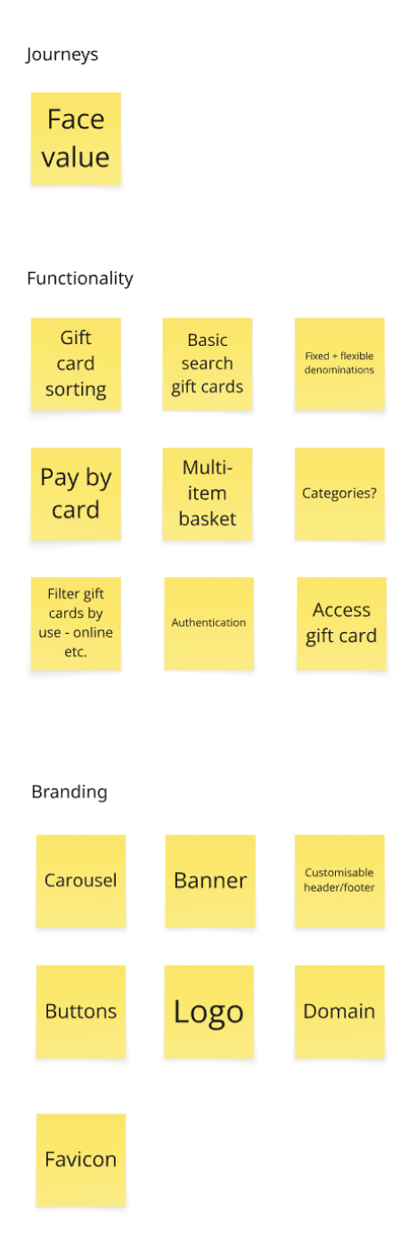
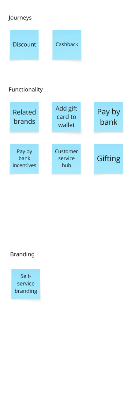
Exploring solutions
We explored several approaches, from bespoke builds to API-only integrations. I helped align stakeholders around a repeatable white-label mall as the most pragmatic MVP. It offered the fastest path to launch, scaled across clients, and avoided over-engineering while leaving room to expand later.
Improve API docs & provide starter templates
Pros
- Lower engineering effort
- Reduce time slightly
Cons
- Customers still have to design/build; doesn’t remove the main barrier
Bespoke gift card mall per customer
Pros
- Maximum branding flexibility
- Customer satisfaction
Cons
- High cost, not scalable, delays launches
Repeatable white-label mall
Pros
- Fastest path to launch, scalable, enough branding flexibility
Cons
- Some compromises in customisation vs bespoke

The solution
The final approach was a modular, white-label gift card mall that could be branded per customer, required minimal setup, and could be reused across multiple clients.
Research
Competitor analysis
To understand the landscape, I reviewed existing white-label and gift card solutions, focusing on UX quality, feature gaps, and overall polish.
Key insights from the analysis:

Limited basket functionality
Most competitors didn’t allow customers to purchase multiple gift cards in a single transaction. This restriction made it harder for clients to maximise sales and created friction for end customers.

UX and UI opportunities
Many existing solutions looked outdated or had unintuitive flows. There was an opportunity for Tillo to differentiate through cleaner design and a smoother purchase journey.

Market opportunity
The number of established competitors was limited, meaning if we launched quickly, Tillo could pioneer the white-label gift card space and gain a first-mover advantage.
Insights from competitor research informed which features to explore and prioritise during the MVP workshop.
Internal stakeholders
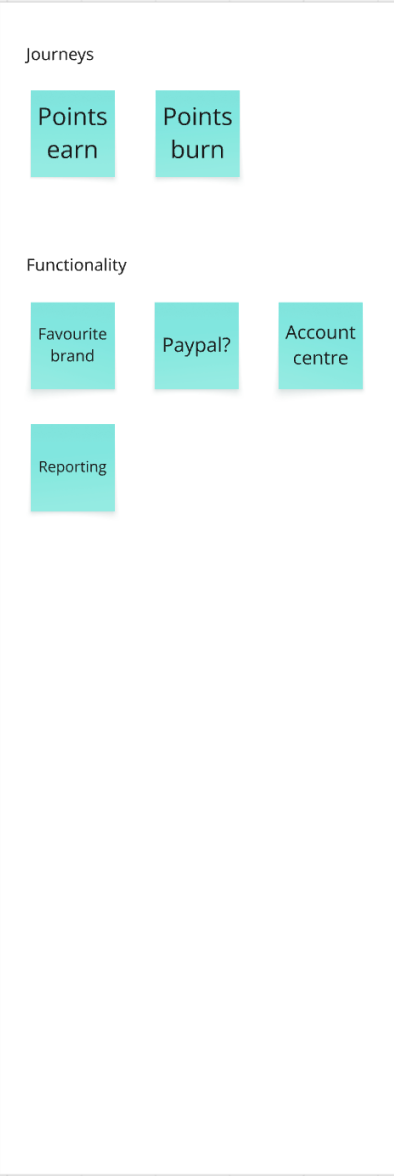
Early discussions surfaced several possible incentive journeys, from simple face-value sales to more complex models like discounts or cashback. To move quickly, we aligned on the simplest proven use case — one we already had a client ready for.
The MVP focused on face-value gift card sales, giving us a solid foundation that could later support more complex incentive journeys without redesigning the platform.
Now
Next
Future
Wireframing
Website structure
With the MVP scope agreed, I mapped a simple user flow to guide wireframing.
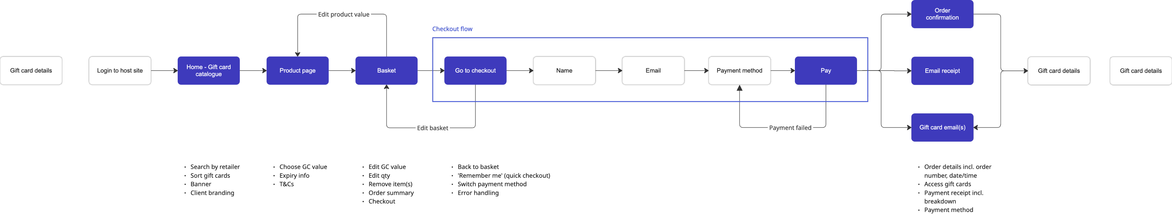
User flow diagram
From flow to wireframes
I used low-fidelity wireframes to quickly explore structure and key screens, validating the direction early with stakeholders before moving into visual design.
Feedback at this stage helped confirm the direction and avoid unnecessary rework later in the process.
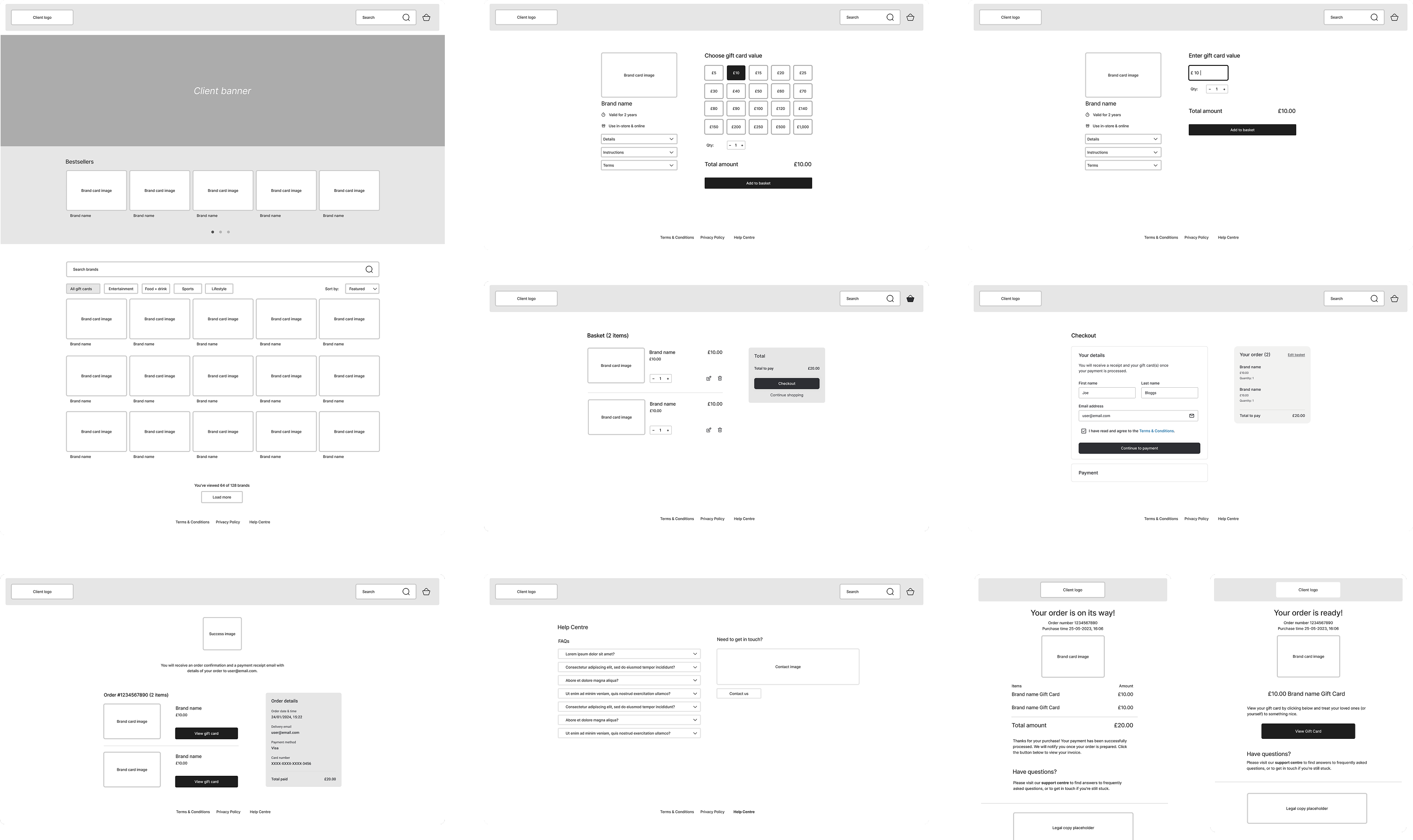
Wireframes
UI Design
With the structure validated, I moved into UI design. The journey followed familiar e-commerce patterns (browse → basket → checkout → confirmation) to reduce friction for end customers.
Rather than running formal usability testing at this stage, I focused on creating a small, modular design system that could be used across different client brands while keeping the experience consistent.
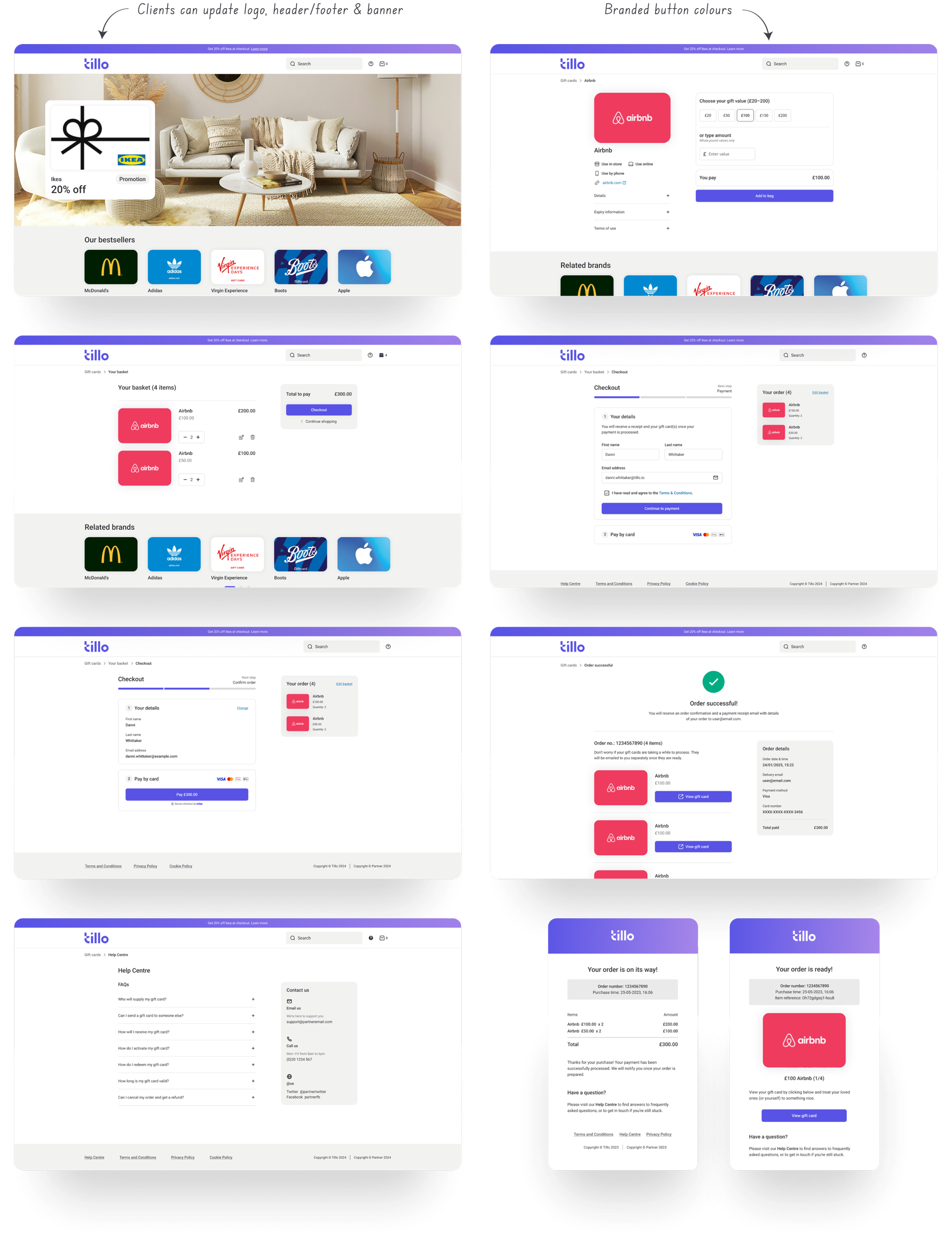
Desktop screens
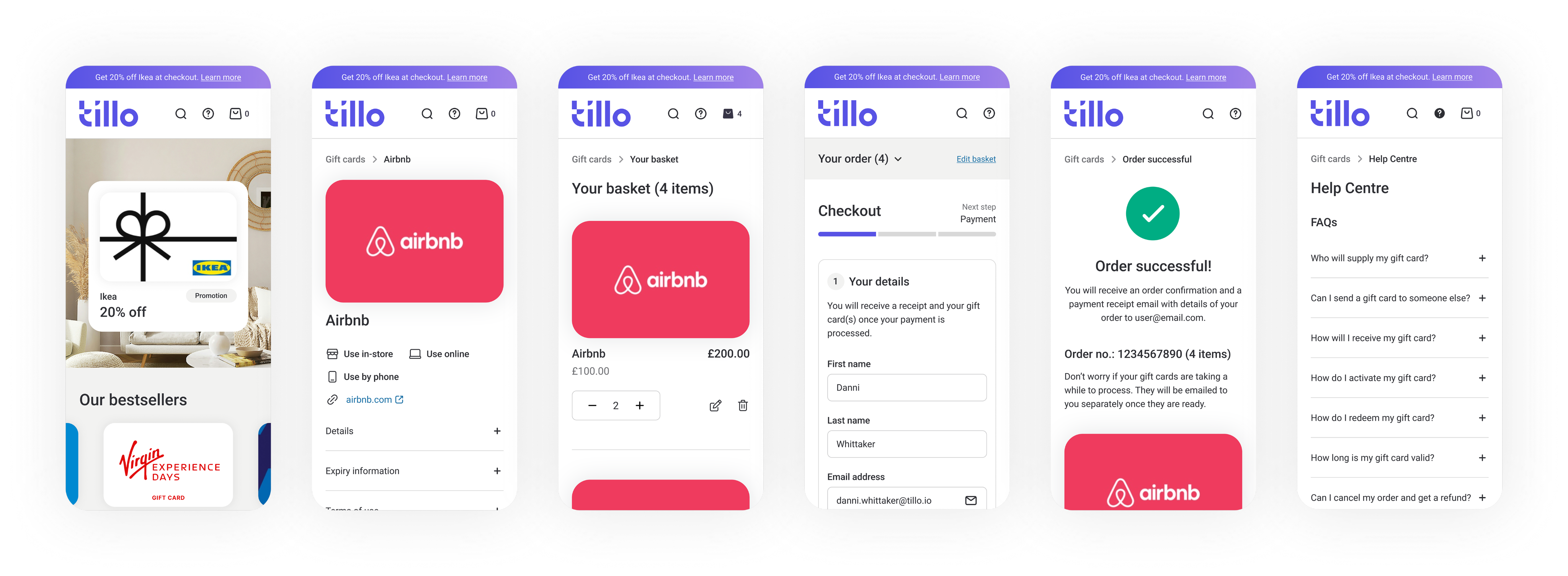
Mobile screens
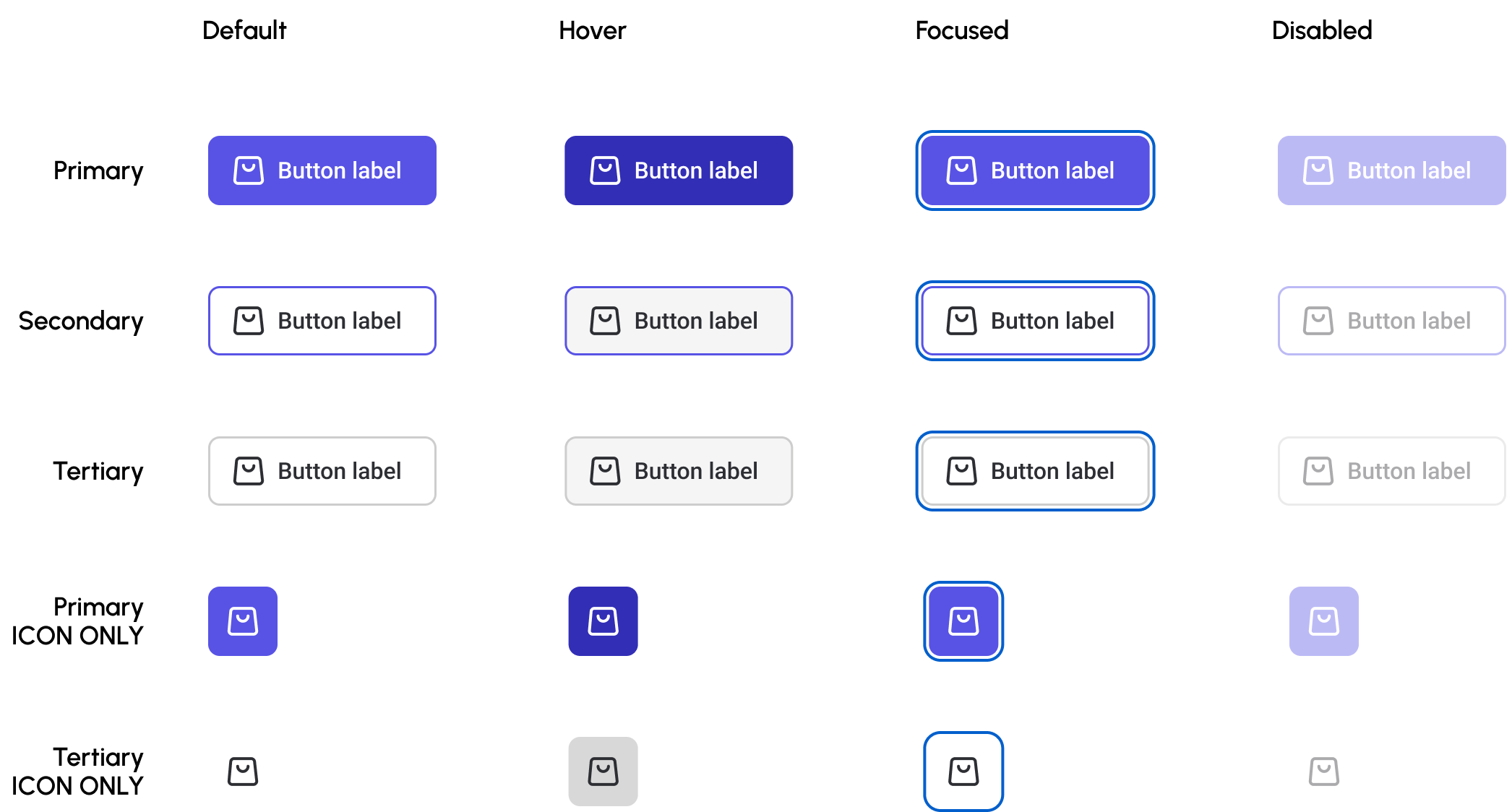
Modular design system
At the time, Tillo didn’t have a formal design system. Because this product needed to be white-label, the UI had to feel neutral by default while still allowing meaningful brand customisation.
I worked closely with developers to define a set of simple tokens and components, including colours, typography, and variables giving us consistency across the MVP and a foundation we could scale for future clients.
Typography (snapshot)
H1
Font Size
Font Weight
Line Height
Page headers
26px
Medium
Auto
The quick brown fox jumps over the lazy dog
Components (snapshot)
Client review
Before development began, I presented an interactive prototype to the client to validate the design, branding options, and key workflows. This session surfaced minor issues and ensured alignment on expectations, preventing costly changes during development.
Hand-off & Collaboration
Throughout the project, I worked closely with Developers and Product Managers to align on feasibility and functionality. This collaboration meant that designs were practical to build while still meeting client and business needs.
When it came to handoff, I:
- Showcased the product to internal stakeholders, such as PMs & Developers, to walk them through the final design and get sign-off.
- Validated components with developers to ensure the design system was both scalable and easy to implement for future clients.
This ensured the MVP launched quickly without design debt.
Launch
As the MVP neared completion, I continued working alongside Engineering to polish the experience and resolve last-minute issues. Non-essential improvements were logged for post-launch, allowing us to ship a solid, usable MVP on time.
Learnings
Designing for scale
Owning the design end to end pushed me to think systemically and collaborate closely with Engineering to ensure the solution could scale.

Early validation & collaboration
A pre-build client showcase surfaced minor issues before development, highlighting the value of early alignment with stakeholders.
© Danni Whittaker 2026. All Rights Reserved.
Danni Whittaker.
Projects
Resume
White-label gift card platform
Designed a repeatable white-label gift card mall that removed time-to-market barriers for B2B clients and generated £800k+ in revenue.
Project overview
Problem statement
Prospective B2B clients wanted to resell Tillo gift cards, but building and maintaining an e-commerce platform from scratch was a blocker. The effort, cost, and time involved meant deals were being lost despite clear demand.
Mission
The aim was to create a white-label solution that clients could launch quickly, brand with minimal effort, and trust to work out of the box for end customers.
My role
I owned the UX and UI end to end, from defining the MVP scope and mapping user journeys through to visual design, validation, and handover. I worked closely with Product and Engineering to align on feasibility and timelines, and presented the solution directly to a major B2B client to secure rollout approval.
Company
Tillo is a global platform that connects businesses with retailers, making it easy to buy, sell, and distribute digital gift cards.
Tools
FigJam, Figma, Miro
Impact
Profitable
Tillo have made over £800k+ since launch.
£1M+
Generated revenue for Tillo clients.
Market expansion
Enabled Tillo to win key B2B clients in the US and Canada, accelerating international growth.
Scalable
The white-label platform can be deployed for multiple clients without re-building infrastructure, saving time and resources.
Competitive
Differentiates Tillo from competitors by offering a ready-to-go, customisable solution.
15 sites launched
Clients include leading cashback, discount, and points brands in the UK and US.
Discovery
Early conversations with the Sales team revealed a clear pattern behind lost deals. Pricing and features weren’t the issue. The real blocker was implementation effort and speed to market. Clients wanted to start selling gift cards quickly, without designing, building, and supporting a bespoke solution.
The problem in a nutshell
Despite strong demand for gift cards, time and effort to launch were the biggest barriers to adoption.
Defining success
Success meant removing the biggest blocker to adoption: time to launch.
Time
Enable customers to start selling quickly
Scalable
Repeatable solution that could scale across clients
Onboarding
Simple setup and brand customisation
Exploring solutions
We explored several approaches, from bespoke builds to API-only integrations. I helped align stakeholders around a repeatable white-label mall as the most pragmatic MVP. It offered the fastest path to launch, scaled across clients, and avoided over-engineering while leaving room to expand later.
Solution
Pros
Cons
Improve API docs & provide starter templates
- Lower engineering effort
- Reduce time slightly
- Customers still have to design/build; doesn’t remove the main barrier
Bespoke gift card mall per customer
- Maximum branding flexibility
- Customer satisfaction
- High cost, not scalable, delays launches
Repeatable white-label mall
- Fastest path to launch, scalable, enough branding flexibility
- Some compromises in customisation vs bespoke
The solution
The final approach was a modular, white-label gift card mall that could be branded per customer, required minimal setup, and could be reused across multiple clients.
Research
Competitor analysis
To understand the landscape, I reviewed existing white-label and gift card solutions, focusing on UX quality, feature gaps, and overall polish.
Key insights from the analysis:
Limited basket functionality
Most competitors didn’t allow customers to purchase multiple gift cards in a single transaction. This restriction made it harder for clients to maximise sales and created friction for end customers.
UX and UI opportunities
Many existing solutions looked outdated or had unintuitive flows. There was an opportunity for Tillo to differentiate through cleaner design and a smoother purchase journey.
Market opportunity
The number of established competitors was limited, meaning if we launched quickly, Tillo could pioneer the white-label gift card space and gain a first-mover advantage.
Insights from competitor research informed which features to explore and prioritise during the MVP workshop.
Internal stakeholders
Early discussions surfaced several possible incentive journeys, from simple face-value sales to more complex models like discounts or cashback. To move quickly, we aligned on the simplest proven use case — one we already had a client ready for.
The MVP focused on face-value gift card sales, giving us a solid foundation that could later support more complex incentive journeys without redesigning the platform.
Now
Next
Future
Wireframing
Website structure
With the MVP scope agreed, I mapped a simple user flow to guide wireframing.
User flow diagram
From flow to wireframes
I used low-fidelity wireframes to quickly explore structure and key screens, validating the direction early with stakeholders before moving into visual design.
Feedback at this stage helped confirm the direction and avoid unnecessary rework later in the process.
Wireframes
UI Design
With the structure validated, I moved into UI design. The journey followed familiar e-commerce patterns (browse → basket → checkout → confirmation) to reduce friction for end customers.
Rather than running formal usability testing at this stage, I focused on creating a small, modular design system that could be used across different client brands while keeping the experience consistent.
Desktop screens
Mobile screens
Modular design system
At the time, Tillo didn’t have a formal design system. Because this product needed to be white-label, the UI had to feel neutral by default while still allowing meaningful brand customisation.
I worked closely with developers to define a set of simple tokens and components, including colours, typography, and variables giving us consistency across the MVP and a foundation we could scale for future clients.
Typography (snapshot)
H1
Font Size
Font Weight
Line Height
Page headers
26px
Medium
Auto
The quick brown fox jumps over the lazy dog
Components (snapshot)
Client review
Before development began, I walked the client through an interactive prototype to validate branding options and key workflows. This surfaced a handful of minor issues early and helped align expectations, avoiding costly changes later in development.
Hand-off & Collaboration
Throughout the project, I worked closely with Developers and Product Managers to align on feasibility and functionality. This collaboration meant that designs were practical to build while still meeting client and business needs.
When it came to handoff, I:
- Showcased the product to internal stakeholders, such as PMs & Developers, to walk them through the final design and get sign-off.
- Validated components with developers to ensure the design system was both scalable and easy to implement for future clients.
This ensured the MVP launched quickly without design debt.
Launch
As the MVP neared completion, I continued working alongside Engineering to polish the experience and resolve last-minute issues. Non-essential improvements were logged for post-launch, allowing us to ship a solid, usable MVP on time.
Learnings
Designing for scale
Owning the design end to end pushed me to think systemically and collaborate closely with Engineering to ensure the solution could scale.
Early validation & collaboration
A pre-build client showcase surfaced minor issues before development, highlighting the value of early alignment with stakeholders.
© Danni Whittaker 2026. All Rights Reserved.
Danni Whittaker.
Projects
Resume
White-label gift card platform
Designed a repeatable white-label gift card mall that removed time-to-market barriers for B2B clients and generated £800k+ in revenue.
Project overview
Problem statement
Prospective B2B clients wanted to resell Tillo gift cards, but building and maintaining an e-commerce platform from scratch was a blocker. The effort, cost, and time involved meant deals were being lost despite clear demand.
Mission
The aim was to create a white-label solution that clients could launch quickly, brand with minimal effort, and trust to work out of the box for end customers.
My role
I owned the UX and UI end to end, from defining the MVP scope and mapping user journeys through to visual design, validation, and handover. I worked closely with Product and Engineering to align on feasibility and timelines, and presented the solution directly to a major B2B client to secure rollout approval.
Company
Tillo is a global platform that connects businesses with retailers, making it easy to buy, sell, and distribute digital gift cards.
Tools
FigJam, Figma, Miro
Impact
Profitable
Tillo have made over £800k+ since launch.
£1M+
Generated revenue for Tillo clients.
Market expansion
Enabled Tillo to win key B2B clients in the US and Canada, accelerating international growth.
Scalable
The white-label platform can be deployed for multiple clients without re-building infrastructure, saving time and resources.
Competitive
Differentiates Tillo from competitors by offering a ready-to-go, customisable solution.
15 sites launched
Clients include leading cashback, discount, and points brands in the UK and US.
Discovery
Early conversations with the Sales team revealed a clear pattern behind lost deals. Pricing and features weren’t the issue. The real blocker was implementation effort and speed to market. Clients wanted to start selling gift cards quickly, without designing, building, and supporting a bespoke solution.

The problem in a nutshell
Despite strong demand for gift cards, time and effort to launch were the biggest barriers to adoption.
Defining success
Success meant removing the biggest blocker to adoption: time to launch.

Time
Enable customers to start selling quickly
Scalable
Repeatable solution that could scale across clients

Onboarding
Simple setup and brand customisation
Exploring solutions
We explored several approaches, from bespoke builds to API-only integrations. I helped align stakeholders around a repeatable white-label mall as the most pragmatic MVP. It offered the fastest path to launch, scaled across clients, and avoided over-engineering while leaving room to expand later.
Solution
Pros
Cons
Improve API docs & provide starter templates
- Lower engineering effort
- Reduce time slightly
- Customers still have to design/build; doesn’t remove the main barrier
Bespoke gift card mall per customer
- Maximum branding flexibility
- Customer satisfaction
- High cost, not scalable, delays launches
Repeatable white-label mall
- Fastest path to launch, scalable, enough branding flexibility
- Some compromises in customisation vs bespoke

The solution
The final approach was a modular, white-label gift card mall that could be branded per customer, required minimal setup, and could be reused across multiple clients.
Research
Competitor analysis
To understand the landscape, I reviewed existing white-label and gift card solutions, focusing on UX quality, feature gaps, and overall polish.
Key insights from the analysis:
Limited basket functionality
Most competitors didn’t allow customers to purchase multiple gift cards in a single transaction. This restriction made it harder for clients to maximise sales and created friction for end customers.
UX and UI opportunities
Many existing solutions looked outdated or had unintuitive flows. There was an opportunity for Tillo to differentiate through cleaner design and a smoother purchase journey.
Market opportunity
The number of established competitors was limited, meaning if we launched quickly, Tillo could pioneer the white-label gift card space and gain a first-mover advantage.
Insights from competitor research informed which features to explore and prioritise during the MVP workshop.
Internal stakeholders
Early discussions surfaced several possible incentive journeys, from simple face-value sales to more complex models like discounts or cashback. To move quickly, we aligned on the simplest proven use case — one we already had a client ready for.
The MVP focused on face-value gift card sales, giving us a solid foundation that could later support more complex incentive journeys without redesigning the platform.
Now
Next
Future
Wireframing
Website structure
With the MVP scope agreed, I mapped a simple user flow to guide wireframing.
User flow diagram
From flow to wireframes
I used low-fidelity wireframes to quickly explore structure and key screens, validating the direction early with stakeholders before moving into visual design.
Feedback at this stage helped confirm the direction and avoid unnecessary rework later in the process.
Wireframes
UI Design
With the structure validated, I moved into UI design. The journey followed familiar e-commerce patterns (browse → basket → checkout → confirmation) to reduce friction for end customers.
Rather than running formal usability testing at this stage, I focused on creating a small, modular design system that could be used across different client brands while keeping the experience consistent.
Desktop screens
Mobile screens
Modular design system
At the time, Tillo didn’t have a formal design system. Because this product needed to be white-label, the UI had to feel neutral by default while still allowing meaningful brand customisation.
I worked closely with developers to define a set of simple tokens and components, including colours, typography, and variables giving us consistency across the MVP and a foundation we could scale for future clients.
Typography (snapshot)
H1
Font Size
Font Weight
Line Height
Page headers
26px
Medium
Auto
The quick brown fox jumps over the lazy dog
Components (snapshot)
Client review
Before development began, I walked the client through an interactive prototype to validate branding options and key workflows. This surfaced a handful of minor issues early and helped align expectations, avoiding costly changes later in development.
Hand-off & Collaboration
Throughout the project, I worked closely with Developers and Product Managers to align on feasibility and functionality. This collaboration meant that designs were practical to build while still meeting client and business needs.
When it came to handoff, I:
- Showcased the product to internal stakeholders, such as PMs & Developers, to walk them through the final design and get sign-off.
- Validated components with developers to ensure the design system was both scalable and easy to implement for future clients.
This ensured the MVP launched quickly without design debt.
Launch
As the MVP neared completion, I continued working alongside Engineering to polish the experience and resolve last-minute issues. Non-essential improvements were logged for post-launch, allowing us to ship a solid, usable MVP on time.
Learnings

Designing for scale
Owning the design end to end pushed me to think systemically and collaborate closely with Engineering to ensure the solution could scale.

Early validation & collaboration
A pre-build client showcase surfaced minor issues before development, highlighting the value of early alignment with stakeholders.
© Danni Whittaker 2026. All Rights Reserved.