
Danni Whittaker.


Pay by bank checkout
designed an incentive-led pay by bank checkout experience that increased adoption without undermining trust at a sensitive point in the journey.
Project overview
Problem statement
Card payments were the default choice for most StoreFront customers, which meant higher processing costs for the business. The challenge was encouraging pay by bank adoption without disrupting a checkout flow where trust and clarity are critical.
Mission
The aim was to encourage customers to choose pay by bank by clearly communicating the incentive, while keeping the checkout experience simple, transparent, and trustworthy. The incentive needed to feel like a benefit, not a push.
My role
I owned the design direction from concept through to delivery, working closely with Product and Engineering. I also presented the final approach to senior stakeholders, including the CEO.
Company
Tillo is a global platform that connects businesses with retailers, making it easy to buy, sell, and distribute digital gift cards.
Tools
Figma, Miro, Maze


Impact
80% increase
~25% of transactions are now completed using pay by bank,
£20,000+ revenue saved
Revenue saved in processing costs from customers switching to pay by bank.
90% preference
Usability testers preferred Tillo’s new pay by bank messaging and flow when compared to a competitor.
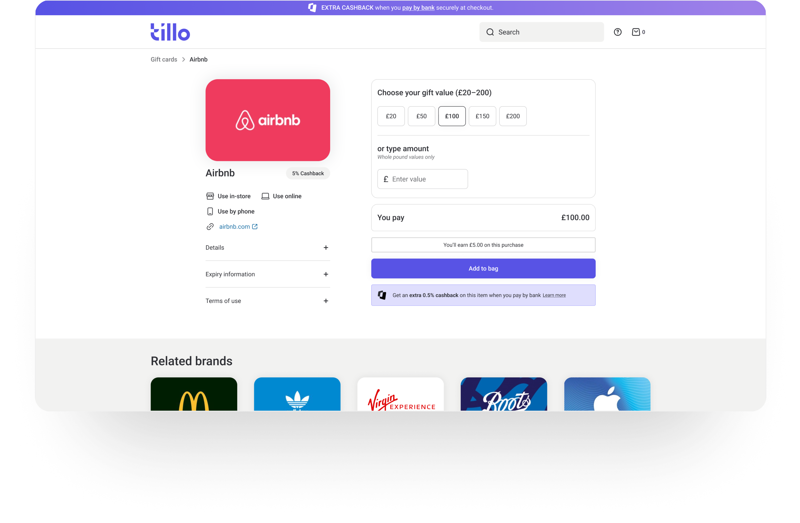
Solution overview
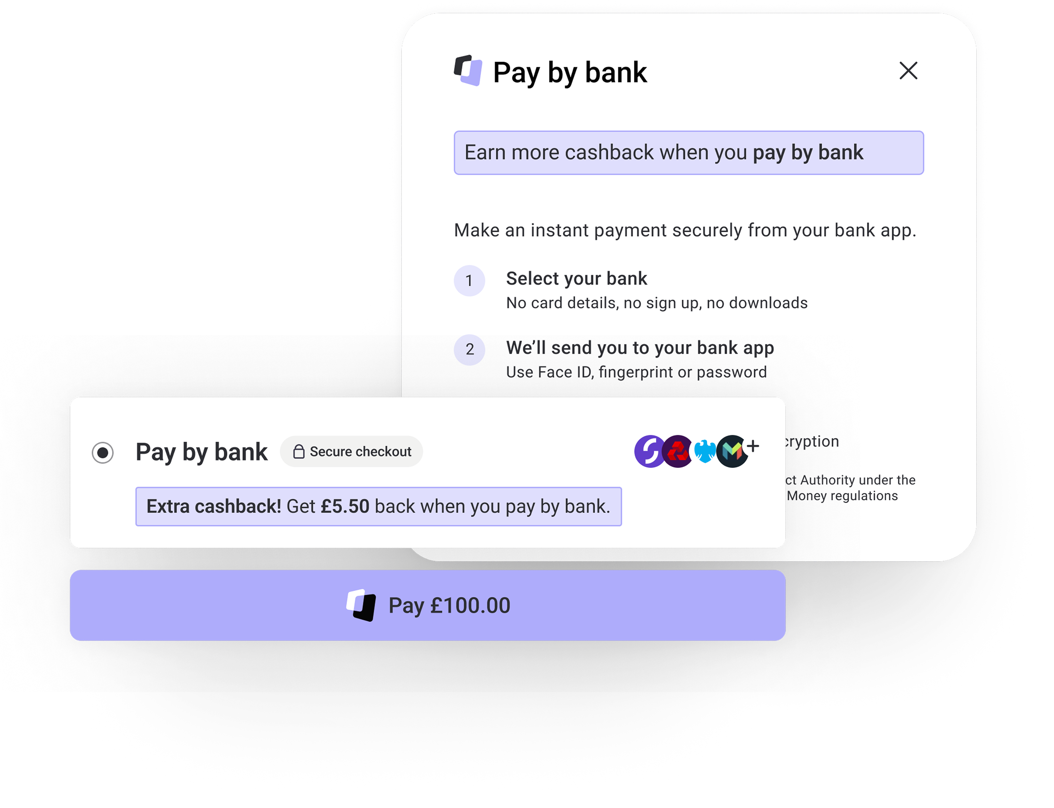
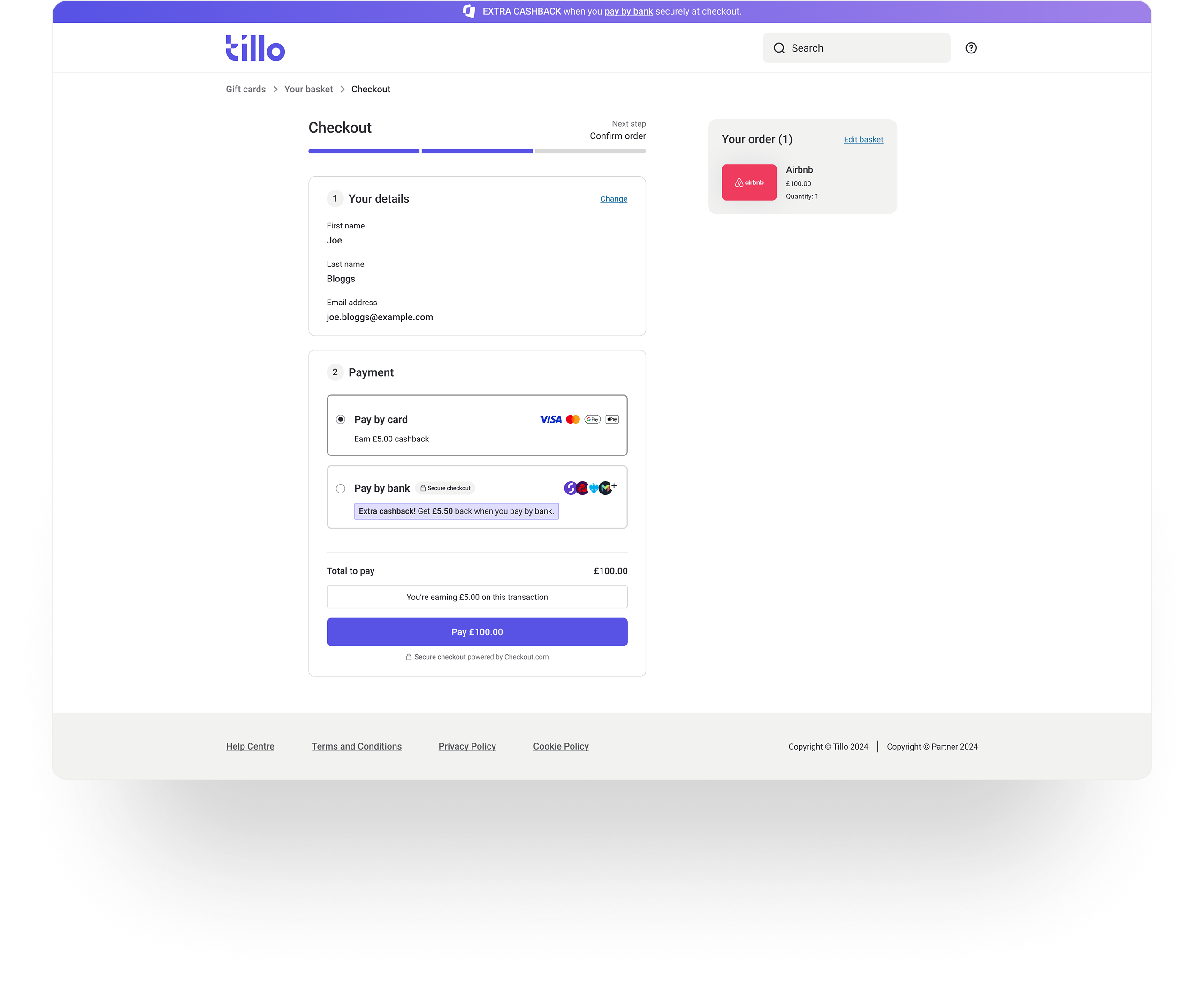
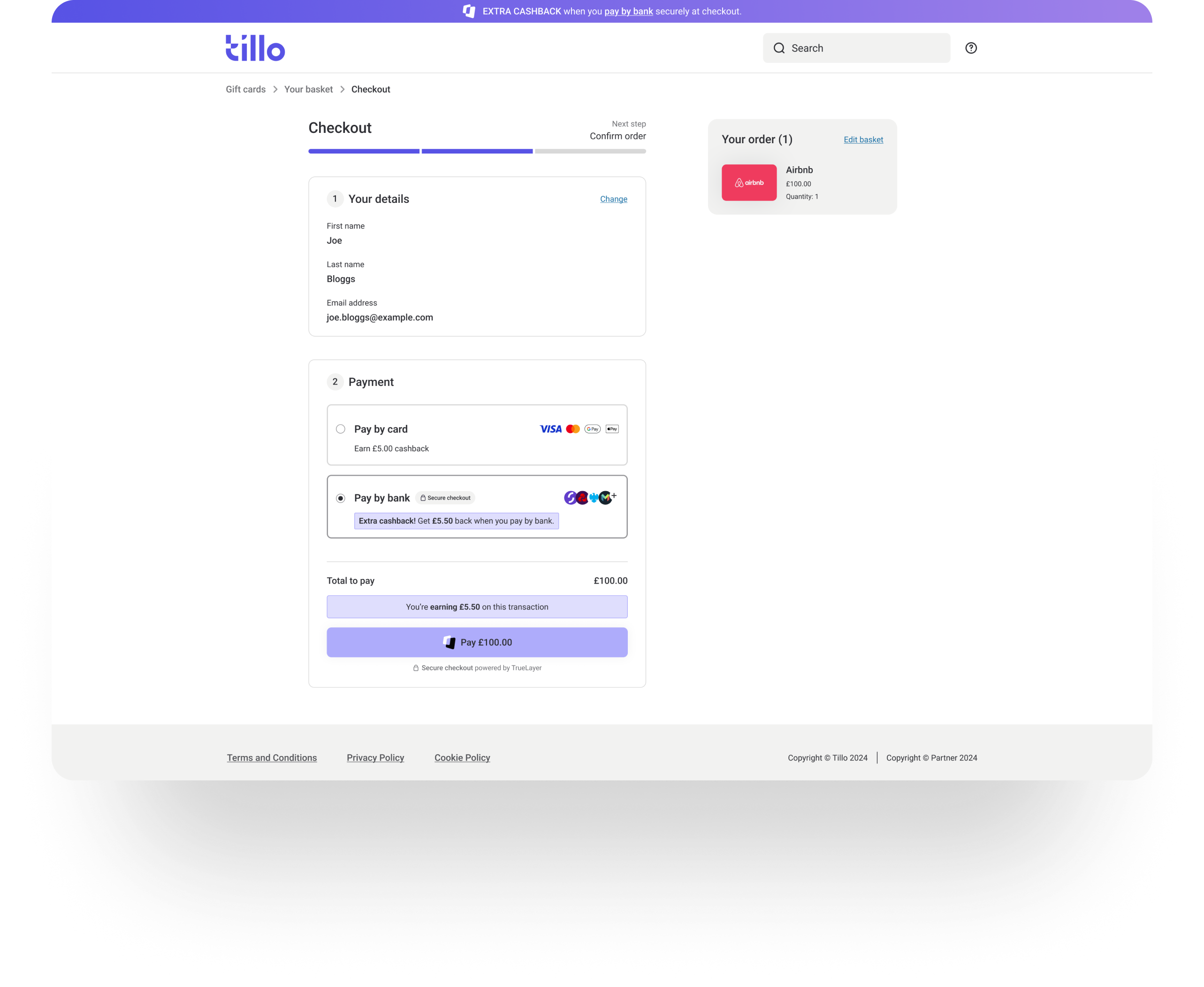
The checkout experience was updated to make pay by bank more visible and appealing at key decision points, while keeping the overall flow familiar for users who preferred to pay by card.

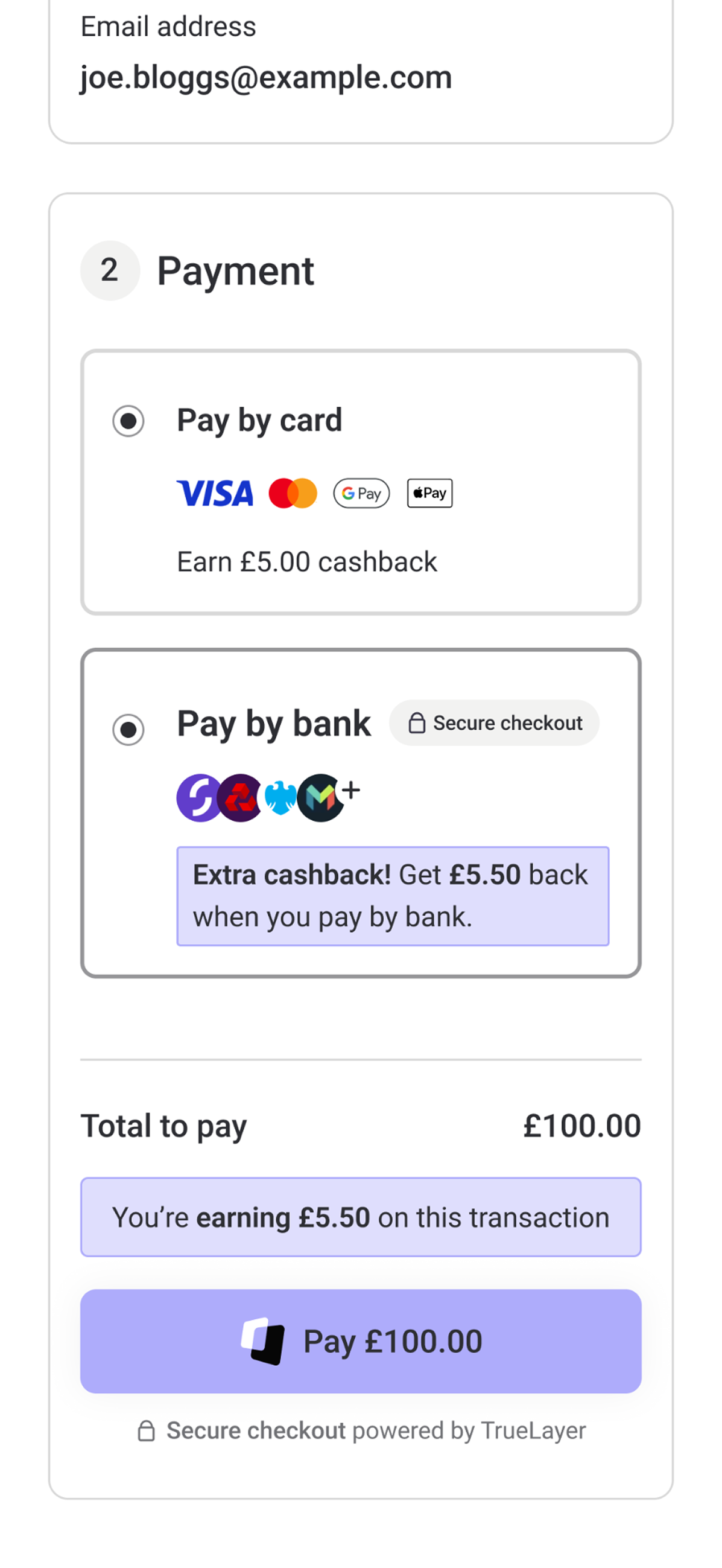
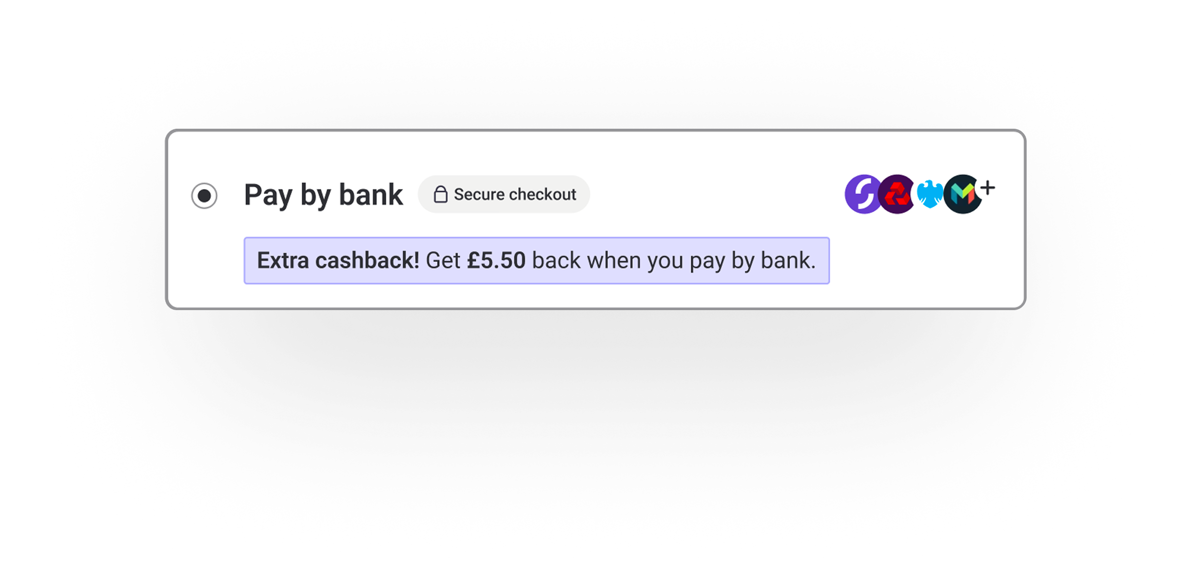
Extra cashback clearly highlighted at checkout

Pay by card still at the top as the most popular checkout option

Checkout page
Key design decisions
Encourage, don’t force
At checkout, pay by bank was encouraged but not pre-selected.
Rationale
Changing payment behaviour at checkout needed careful handling, as trust is critical at this stage of the journey. During competitor research, I saw several forceful patterns, such as pre-selecting pay by bank or, what felt like, penalising card users.
Through usability testing in Maze, including a direct comparison with a more coercive competitor flow, these approaches consistently reduced trust and confidence. Based on this evidence, I deliberately avoided forceful patterns and designed an incentive-led approach that clearly explained the benefit while preserving user choice.
Outcome
Pay by bank was clearly positioned with an incentive, while card payments remained fully available and unchanged.
Checkout page
Surface the incentive progressively across the journey
The general incentive was introduced early and then reinforced at key decision points, rather than presented all at once.
Rationale
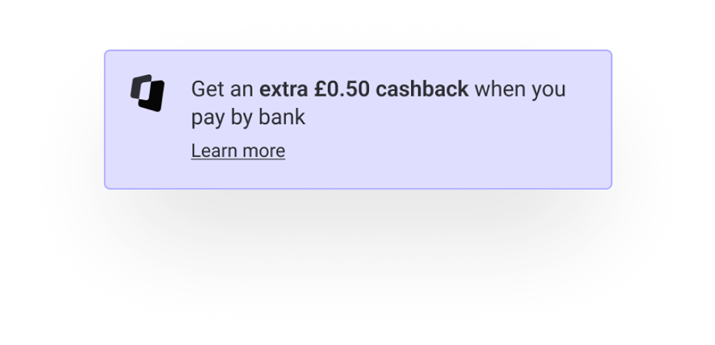
Rather than presenting the full incentive all at once, I introduced it gradually across the journey. Mentioning it on the product page helped set expectations early, while calculating the exact amount at basket level added clarity once intent was higher. Reiterating the incentive at checkout ensured the benefit was visible at the moment of payment choice.
Outcome
Users built an understanding of the incentive over time and were reminded of the benefit when it mattered most, without feeling overwhelmed.
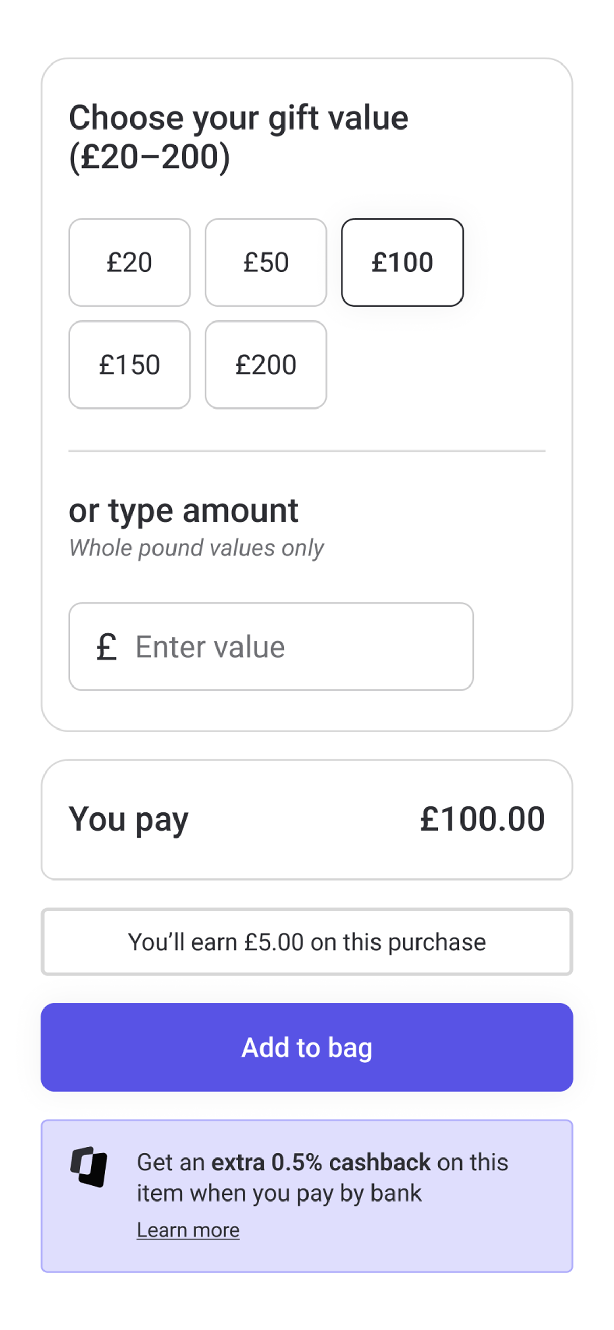
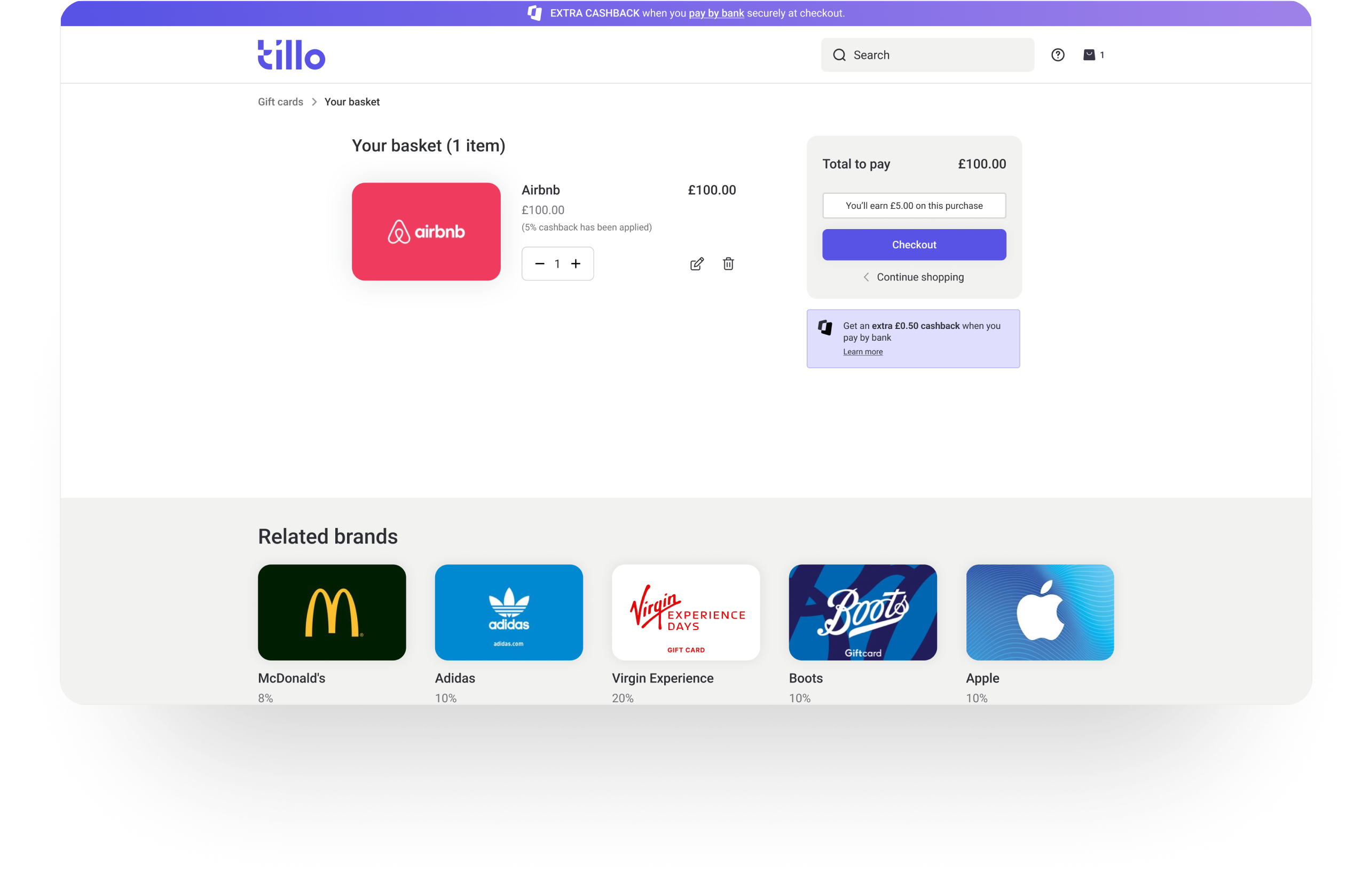
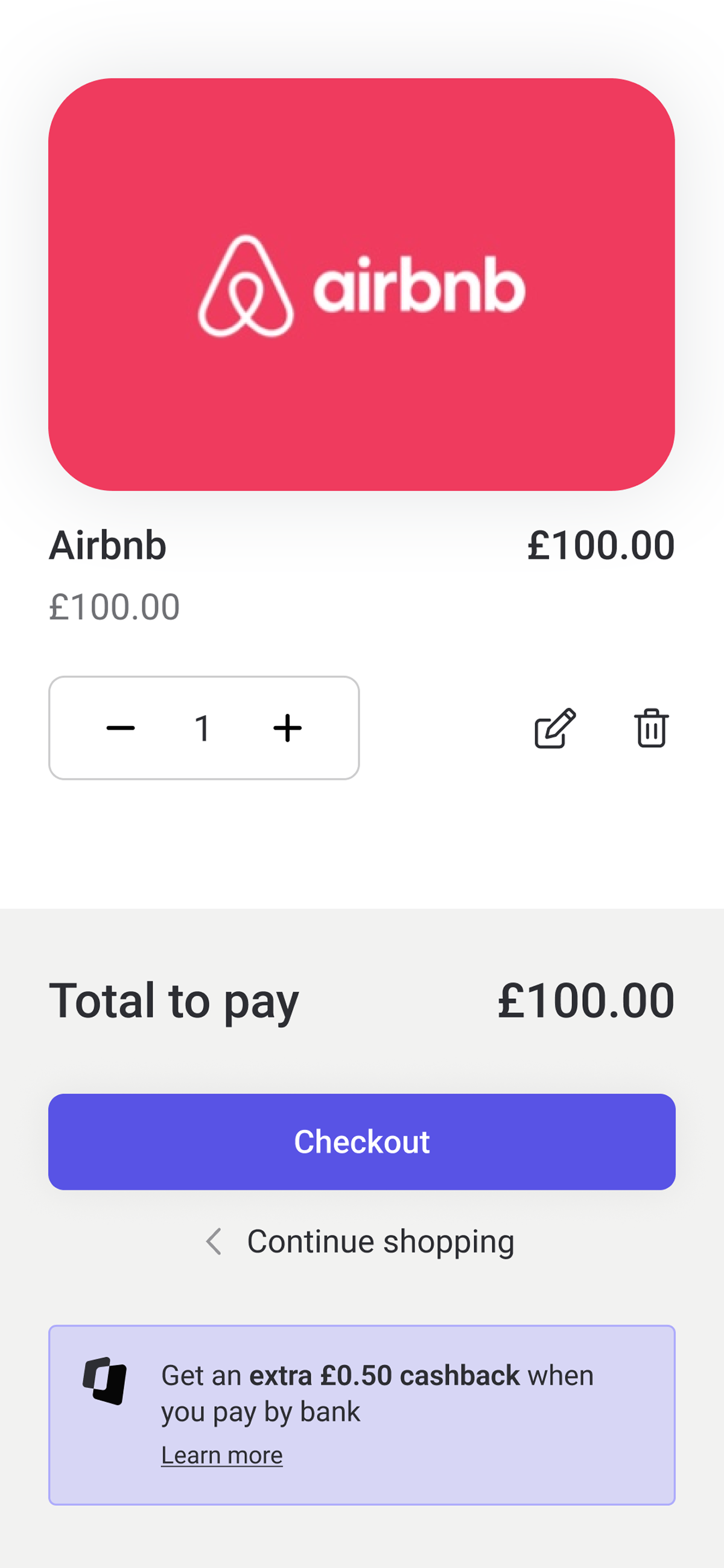
Product & basket pages
Use reassuring, neutral language
Copy and visual emphasis were kept clear and reassuring, avoiding urgency or pressure.
Rationale
Feedback from the questionnaire highlighted trust and security as key concerns around pay by bank. Overly promotional or guilt-inducing language risked making the option feel unfamiliar or unsafe, particularly in a payment context.
Outcome
Pay by bank was framed as a legitimate option, by giving information via ‘Learn more’ and highlighting security, helping users feel comfortable trying it.
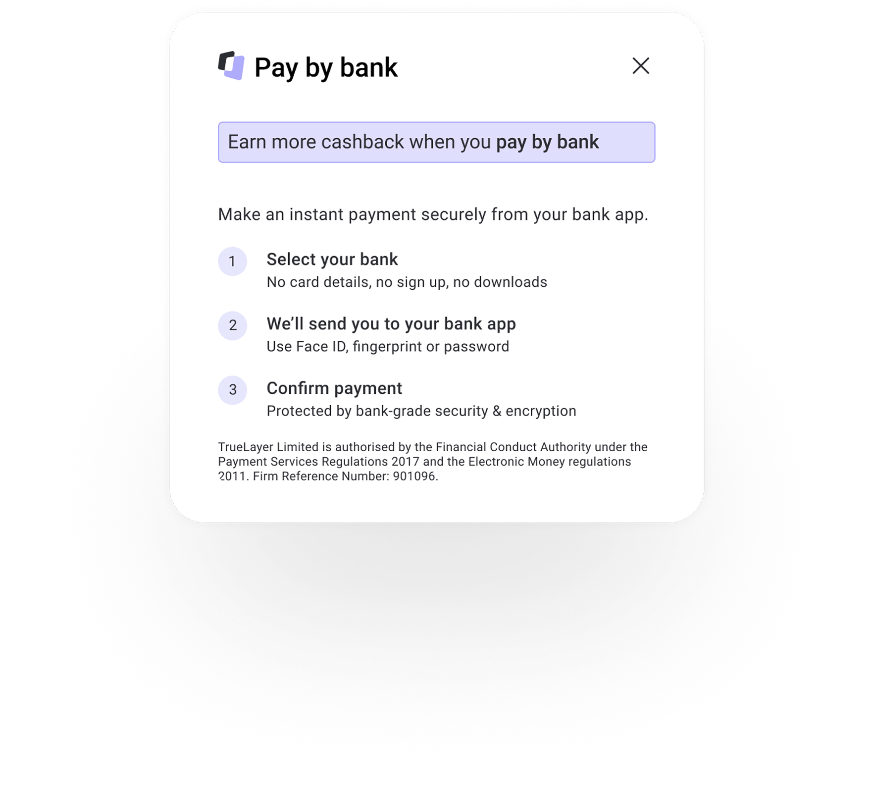
Pay by bank messaging
Final designs
The final solution applied the incentive progressively across the journey, reinforcing the benefit at key moments while keeping the checkout experience familiar and trustworthy.

Final screens
Validation & alignment
Before launch, I presented the approach to senior stakeholders, including the CEO, to align on risk and ensure the solution balanced commercial goals with user trust.
I also walked through the designs with one of Tillo’s largest cashback customers ahead of launch. Their feedback reinforced the importance of keeping the checkout experience simple and familiar, and they were comfortable with how the incentive was presented throughout the flow.
This internal and external validation helped confirm we’d struck the right balance between encouraging adoption and maintaining trust.
Learnings

Time constraints
Working to a tight turnaround reinforced the importance of making clear decisions early. Focusing on the core problem, while still carrying out targeted research, helped me move quickly without compromising usability.

Nudge, don’t force
Designing incentives within a checkout flow highlighted how easily trust can be lost. As expected, research showed that aggressive patterns risk eroding confidence, particularly in payments, where clarity and choice matter most.

Early alignment
Aligning early with senior stakeholders and a key customer helped de-risk the approach and avoid late changes during a high-pressure delivery window.
© Danni Whittaker 2026. All Rights Reserved.
Danni Whittaker.
Projects
Resume
Pay by bank checkout
designed an incentive-led pay by bank checkout experience that increased adoption without undermining trust at a sensitive point in the journey.
Project overview
Problem statement
Card payments were the default choice for most StoreFront customers, which meant higher processing costs for the business. The challenge was encouraging pay by bank adoption without disrupting a checkout flow where trust and clarity are critical.
Mission
The aim was to encourage customers to choose pay by bank by clearly communicating the incentive, while keeping the checkout experience simple, transparent, and trustworthy. The incentive needed to feel like a benefit, not a push.
My role
I owned the design direction from concept through to delivery, working closely with Product and Engineering. I also presented the final approach to senior stakeholders, including the CEO.
Company
Tillo is a global platform that connects businesses with retailers, making it easy to buy, sell, and distribute digital gift cards.
Tools
Figma, Miro, Maze
Impact
80% increase
~25% of transactions are now completed using pay by bank,
£20,000+ revenue saved
Revenue saved in processing costs from customers switching to pay by bank.
90% preference
Usability testers preferred Tillo’s new pay by bank messaging and flow when compared to a competitor.
Solution overview
The checkout experience was updated to make pay by bank more visible and appealing at key decision points, while keeping the overall flow familiar for users who preferred to pay by card.
Extra cashback clearly highlighted at checkout
Pay by card still at the top as the most popular checkout option
Checkout page
Key design decisions
Encourage, don’t force
At checkout, pay by bank was encouraged but not pre-selected.
Rationale
Changing payment behaviour at checkout needed careful handling, as trust is critical at this stage of the journey. During competitor research, I saw several forceful patterns, such as pre-selecting pay by bank or, what felt like, penalising card users.
Through usability testing in Maze, including a direct comparison with a more coercive competitor flow, these approaches consistently reduced trust and confidence. Based on this evidence, I deliberately avoided forceful patterns and designed an incentive-led approach that clearly explained the benefit while preserving user choice.
Outcome
Pay by bank was clearly positioned with an incentive, while card payments remained fully available and unchanged.
Checkout page
Surface the incentive progressively across the journey
The general incentive was introduced early and then reinforced at key decision points, rather than presented all at once.
Rationale
Rather than presenting the full incentive all at once, I introduced it gradually across the journey. Mentioning it on the product page helped set expectations early, while calculating the exact amount at basket level added clarity once intent was higher. Reiterating the incentive at checkout ensured the benefit was visible at the moment of payment choice.
Outcome
Users built an understanding of the incentive over time and were reminded of the benefit when it mattered most, without feeling overwhelmed.
Product & basket pages
Use reassuring, neutral language
Copy and visual emphasis were kept clear and reassuring, avoiding urgency or pressure.
Rationale
Feedback from the questionnaire highlighted trust and security as key concerns around pay by bank. Overly promotional or guilt-inducing language risked making the option feel unfamiliar or unsafe, particularly in a payment context.
Outcome
Pay by bank was framed as a legitimate option, by giving information via ‘Learn more’ and highlighting security, helping users feel comfortable trying it.
Pay by bank messaging
Final designs
The final solution applied the incentive progressively across the journey, reinforcing the benefit at key moments while keeping the checkout experience familiar and trustworthy.
Final screens
Validation & alignment
Before launch, I presented the approach to senior stakeholders, including the CEO, to align on risk and ensure the solution balanced commercial goals with user trust.
I also walked through the designs with one of Tillo’s largest cashback customers ahead of launch. Their feedback reinforced the importance of keeping the checkout experience simple and familiar, and they were comfortable with how the incentive was presented throughout the flow.
This internal and external validation helped confirm we’d struck the right balance between encouraging adoption and maintaining trust.
Learnings
Time constraints
Working to a tight turnaround reinforced the importance of making clear decisions early. Focusing on the core problem, while still carrying out targeted research, helped me move quickly without compromising usability.
Nudge, don’t force
Designing incentives within a checkout flow highlighted how easily trust can be lost. As expected, research showed that aggressive patterns risk eroding confidence, particularly in payments, where clarity and choice matter most.
Early alignment
Aligning early with senior stakeholders and a key customer helped de-risk the approach and avoid late changes during a high-pressure delivery window.
© Danni Whittaker 2026. All Rights Reserved.
Danni Whittaker.
Projects
Resume
Pay by bank checkout
designed an incentive-led pay by bank checkout experience that increased adoption without undermining trust at a sensitive point in the journey.
Project overview
Problem statement
Card payments were the default choice for most StoreFront customers, which meant higher processing costs for the business. The challenge was encouraging pay by bank adoption without disrupting a checkout flow where trust and clarity are critical.
Mission
The aim was to encourage customers to choose pay by bank by clearly communicating the incentive, while keeping the checkout experience simple, transparent, and trustworthy. The incentive needed to feel like a benefit, not a push.
My role
I owned the design direction from concept through to delivery, working closely with Product and Engineering. I also presented the final approach to senior stakeholders, including the CEO.
Company
Tillo is a global platform that connects businesses with retailers, making it easy to buy, sell, and distribute digital gift cards.
Tools
Figma, Miro, Maze
Impact
80% increase
~25% of transactions are now completed using pay by bank,
£20,000+ revenue saved
Revenue saved in processing costs from customers switching to pay by bank.
90% preference
Usability testers preferred Tillo’s new pay by bank messaging and flow when compared to a competitor.
Solution overview
The checkout experience was updated to make pay by bank more visible and appealing at key decision points, while keeping the overall flow familiar for users who preferred to pay by card.
Extra cashback clearly highlighted at checkout
Pay by card still at the top as the most popular checkout option
Checkout page
Key design decisions
Encourage, don’t force
At checkout, pay by bank was encouraged but not pre-selected.
Rationale
Changing payment behaviour at checkout needed careful handling, as trust is critical at this stage of the journey. During competitor research, I saw several forceful patterns, such as pre-selecting pay by bank or, what felt like, penalising card users.
Through usability testing in Maze, including a direct comparison with a more coercive competitor flow, these approaches consistently reduced trust and confidence. Based on this evidence, I deliberately avoided forceful patterns and designed an incentive-led approach that clearly explained the benefit while preserving user choice.
Outcome
Pay by bank was clearly positioned with an incentive, while card payments remained fully available and unchanged.
Checkout page
Surface the incentive progressively across the journey
The general incentive was introduced early and then reinforced at key decision points, rather than presented all at once.
Rationale
Rather than presenting the full incentive all at once, I introduced it gradually across the journey. Mentioning it on the product page helped set expectations early, while calculating the exact amount at basket level added clarity once intent was higher. Reiterating the incentive at checkout ensured the benefit was visible at the moment of payment choice.
Outcome
Users built an understanding of the incentive over time and were reminded of the benefit when it mattered most, without feeling overwhelmed.
Product & basket pages
Use reassuring, neutral language
Copy and visual emphasis were kept clear and reassuring, avoiding urgency or pressure.
Rationale
Feedback from the questionnaire highlighted trust and security as key concerns around pay by bank. Overly promotional or guilt-inducing language risked making the option feel unfamiliar or unsafe, particularly in a payment context.
Outcome
Pay by bank was framed as a legitimate option, by giving information via ‘Learn more’ and highlighting security, helping users feel comfortable trying it.
Pay by bank messaging
Final designs
The final solution applied the incentive progressively across the journey, reinforcing the benefit at key moments while keeping the checkout experience familiar and trustworthy.
Final screens
Validation & alignment
Before launch, I presented the approach to senior stakeholders, including the CEO, to align on risk and ensure the solution balanced commercial goals with user trust.
I also walked through the designs with one of Tillo’s largest cashback customers ahead of launch. Their feedback reinforced the importance of keeping the checkout experience simple and familiar, and they were comfortable with how the incentive was presented throughout the flow.
This internal and external validation helped confirm we’d struck the right balance between encouraging adoption and maintaining trust.
Learnings

Time constraints
Working to a tight turnaround reinforced the importance of making clear decisions early. Focusing on the core problem, while still carrying out targeted research, helped me move quickly without compromising usability.
Nudge, don’t force
Designing incentives within a checkout flow highlighted how easily trust can be lost. As expected, research showed that aggressive patterns risk eroding confidence, particularly in payments, where clarity and choice matter most.

Early alignment
Aligning early with senior stakeholders and a key customer helped de-risk the approach and avoid late changes during a high-pressure delivery window.
© Danni Whittaker 2026. All Rights Reserved.