
Danni Whittaker.


Design system
Created a shared design system to improve consistency, accessibility, and delivery speed across Tillo’s customer hubs.
Project overview
Problem statement
Without a design system in place, Tillo’s customer hubs had grown inconsistent and outdated. Components were frequently duplicated, work was repeated, and the overall experience no longer reflected the updated Tillo brand.
Mission
The aim was to modernise the Tillo hubs, bring them in line with updated branding, and improve usability, while creating a design system that could support consistent and scalable future development.
My role
I owned key UI and system decisions, worked closely with Marketing and Engineering, and coordinated implementation across two engineering teams to ensure consistency during build.
Company
Tillo is a global platform that connects businesses with retailers, making it easy to buy, sell, and distribute digital gift cards.
Tools
FigJam, Figma, Miro, Mouseflow


Impact
4x faster
Faster design & development cycles, as reusable components reduced duplicated work.
Collaboration
Stronger team collaboration – daily/weekly syncs kept everyone aligned.
Improved UX
More intuitive flows, repeated design patterns and familiar interactions for users.
Consistent branding
Unified look across all Tillo customer touchpoints.
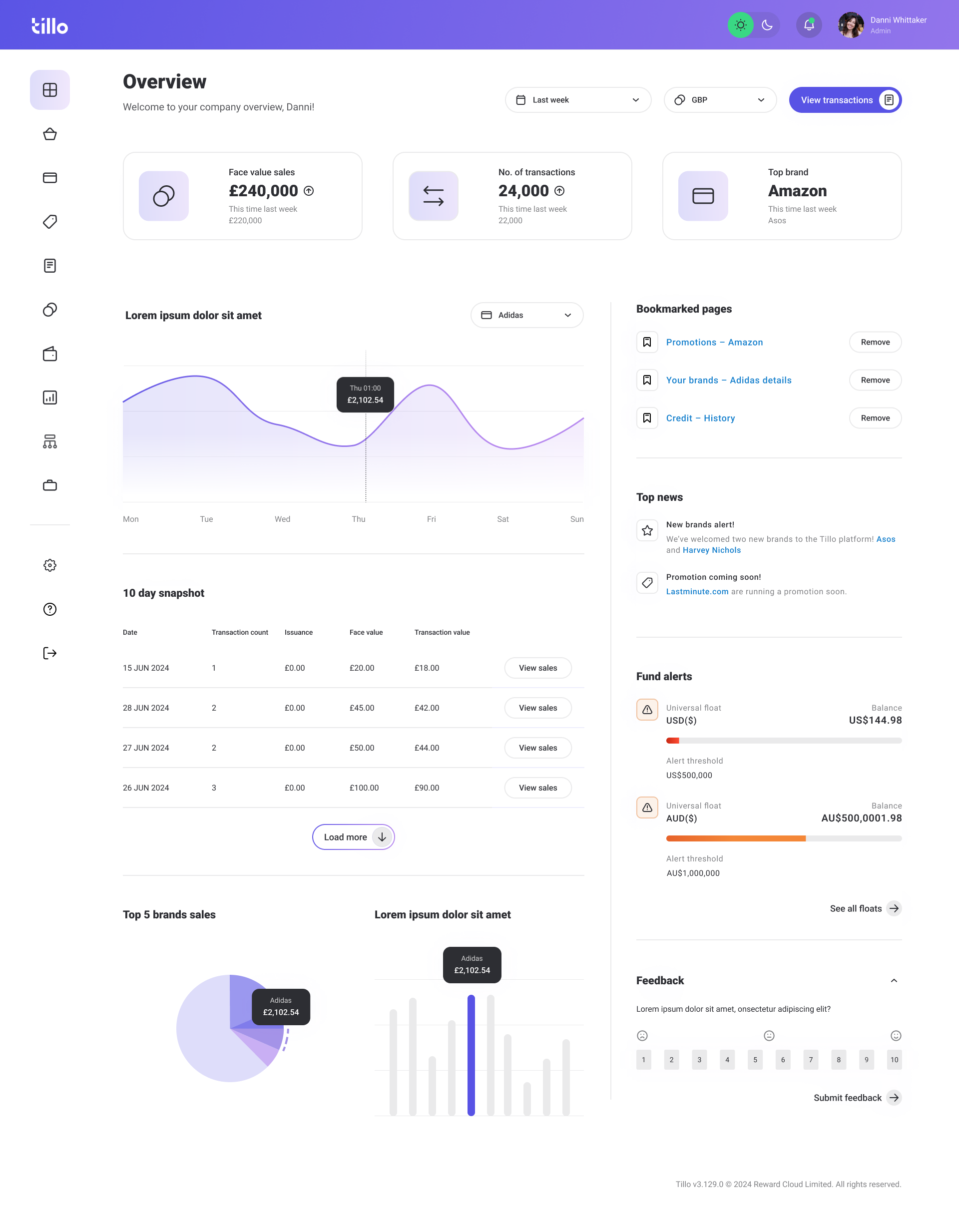
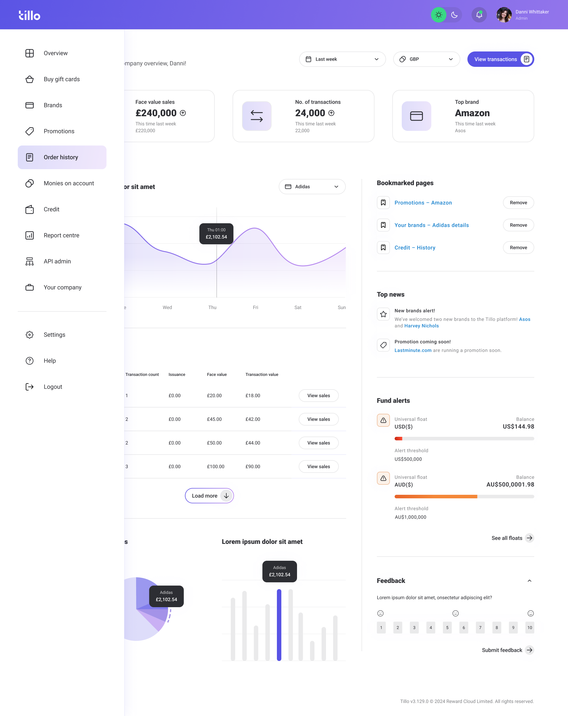
Background
Tillo’s customer hubs are B2B platforms used to manage orders, reporting, and cashflow. Over time, multiple hubs were built to support different customer types, including Buyers, Brands, and StoreFront clients. As these hubs evolved independently, the experience became fragmented for users who interacted across more than one platform.
Discovery & alignment
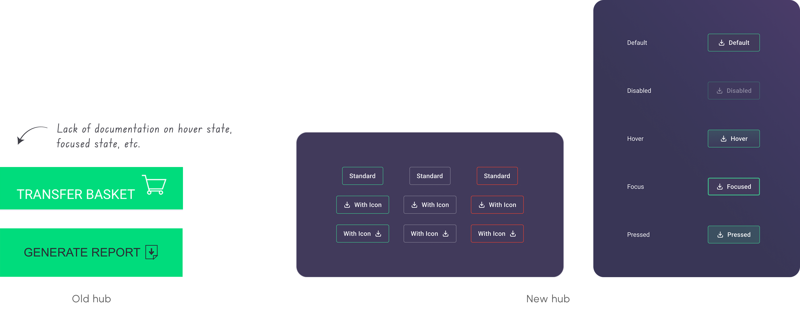
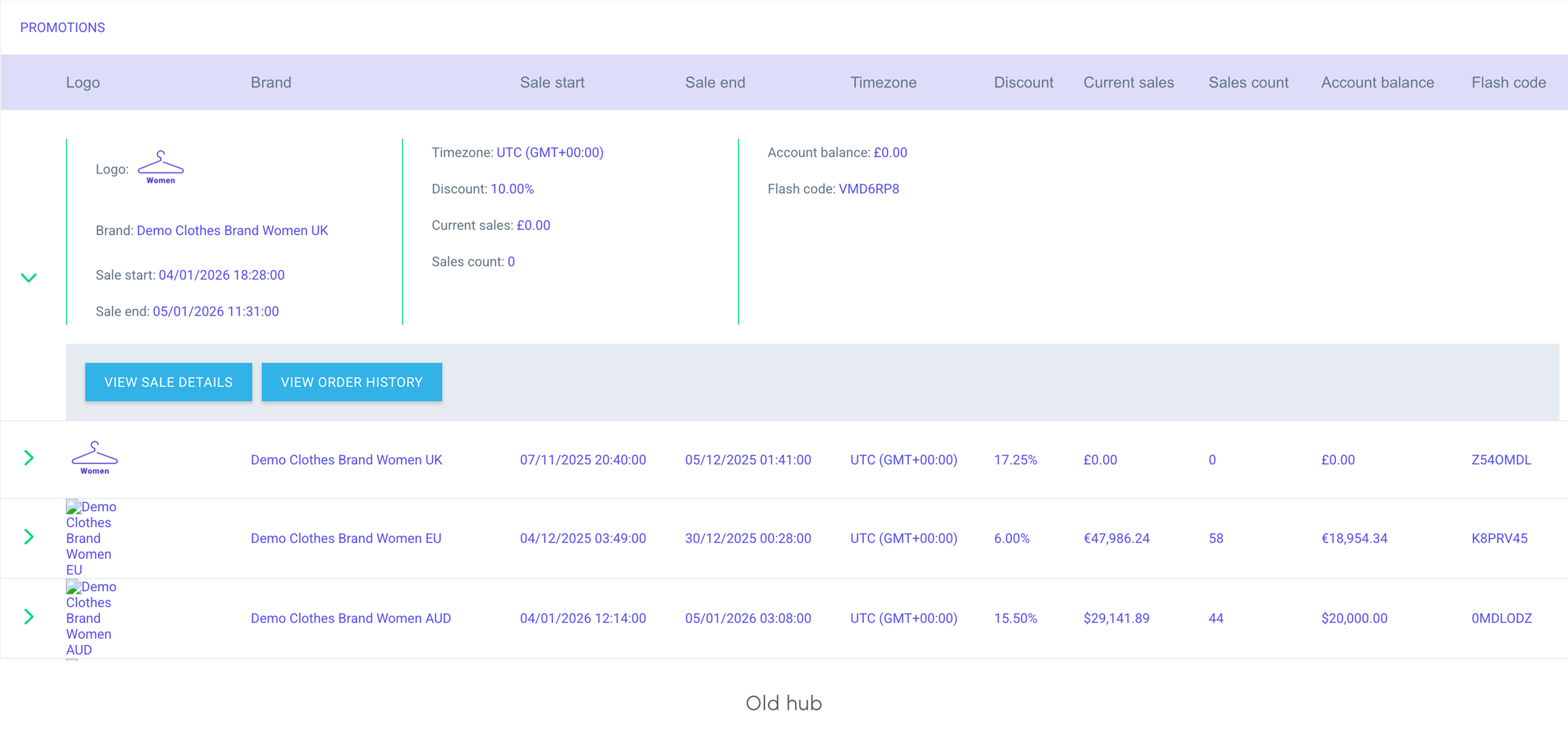
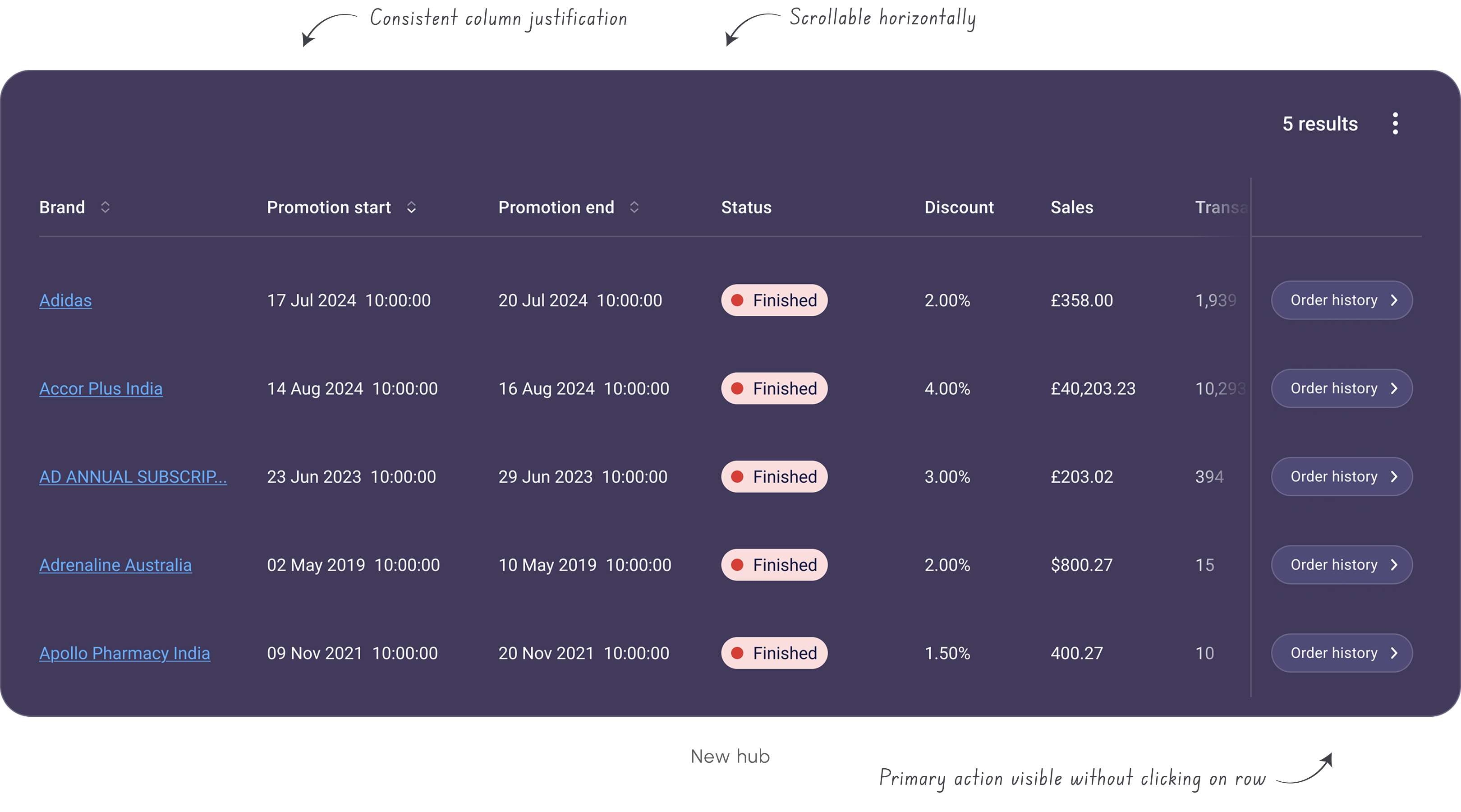
I carried out an audit of the existing hubs, which quickly revealed inconsistencies across buttons, tables, filters, layout patterns, etc. Similar elements behaved differently depending on the hub, increasing cognitive load for users and creating extra maintenance work for teams.
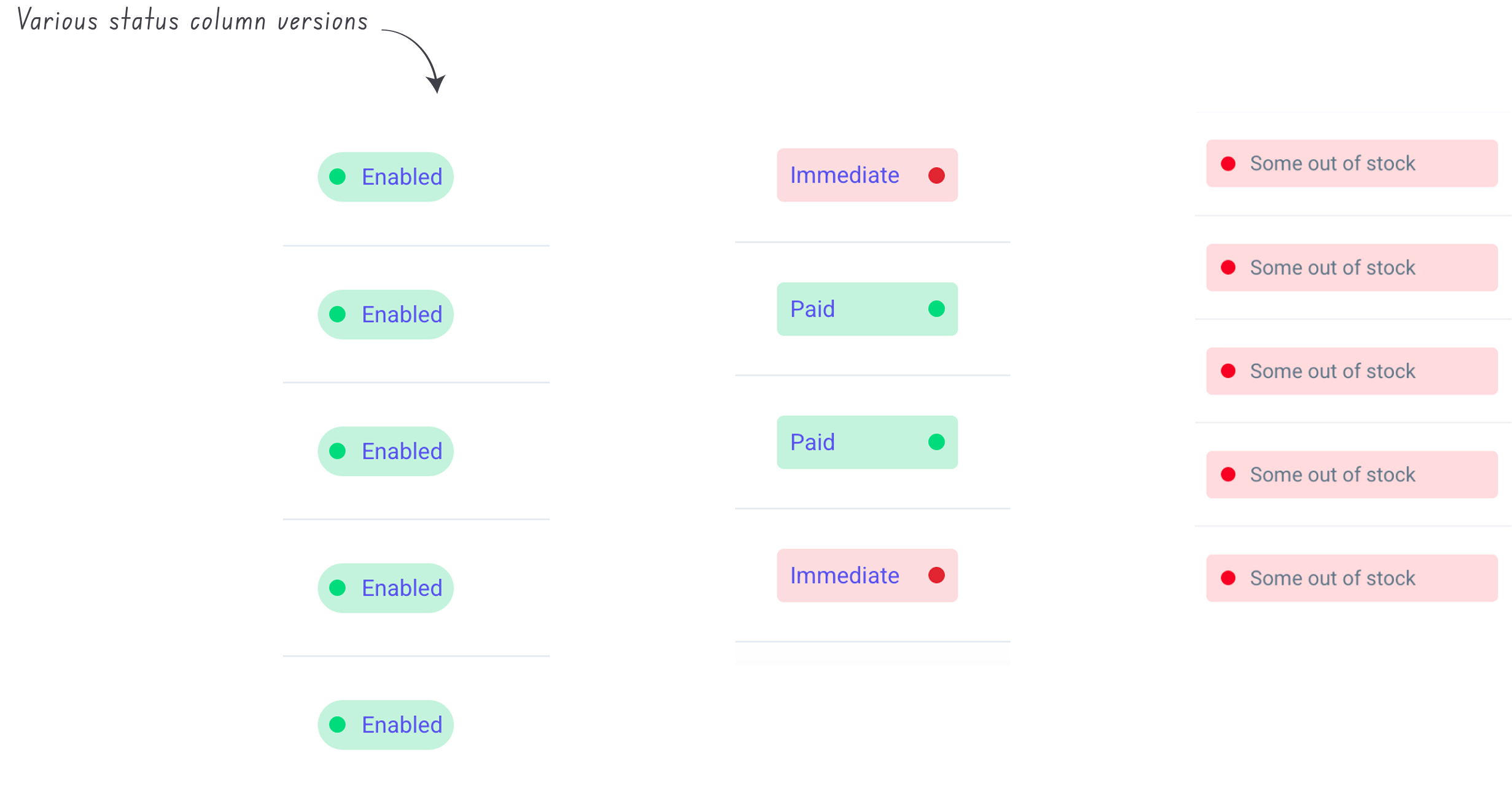
Inconsistent components
Buttons and tables were two of the most common problem areas. Variations in sizing, colour, states, and interaction patterns made the experience feel unpredictable and increased development overhead.


Edit button
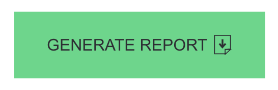
Primary button
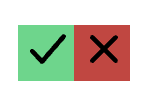
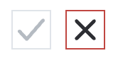
Accept/reject buttons
Branding misalignment
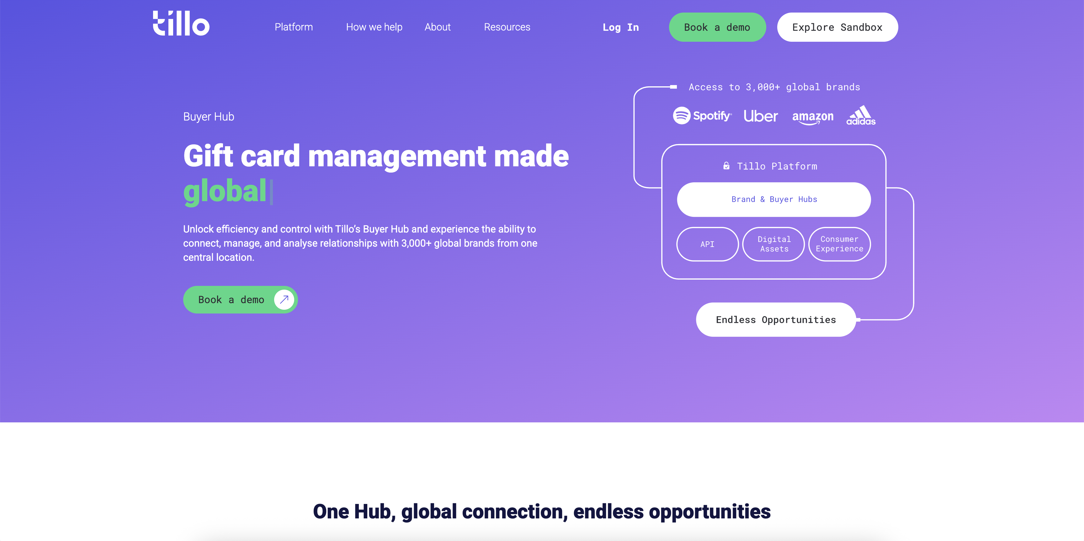
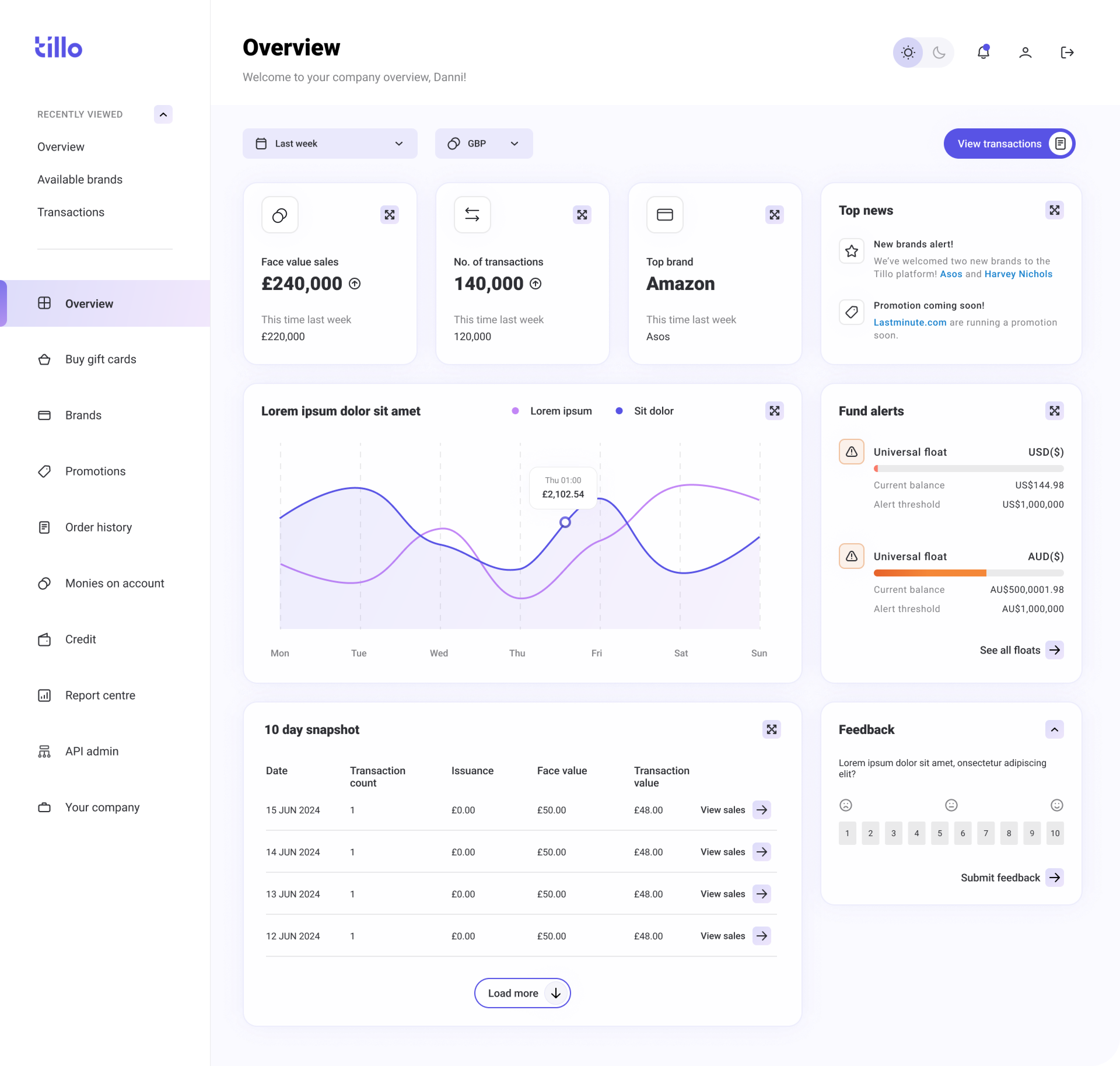
In parallel, I worked closely with Marketing to align the hubs with Tillo’s updated brand. We addressed inconsistencies in colour, typography, and tone that contributed to a dated look, while making sure the refreshed UI remained flexible enough to work across multiple hubs.
Tillo marketing website
Tillo buyer hub
Exploring solutions
We explored two main approaches:
- A light visual refresh to align existing hubs with updated branding
- A full refresh introducing shared tokens, components, and patterns
While the lighter option offered faster visual consistency, it would not solve duplicated components or long-term scalability. I helped align stakeholders around the full refresh, as it addressed immediate UX issues and reduced the risk of repeated rework.

The solution
We moved forward with a full refresh supported by a design system, Pavilion, to fix immediate UX inconsistencies while creating a scalable foundation for future hubs.
Ideation
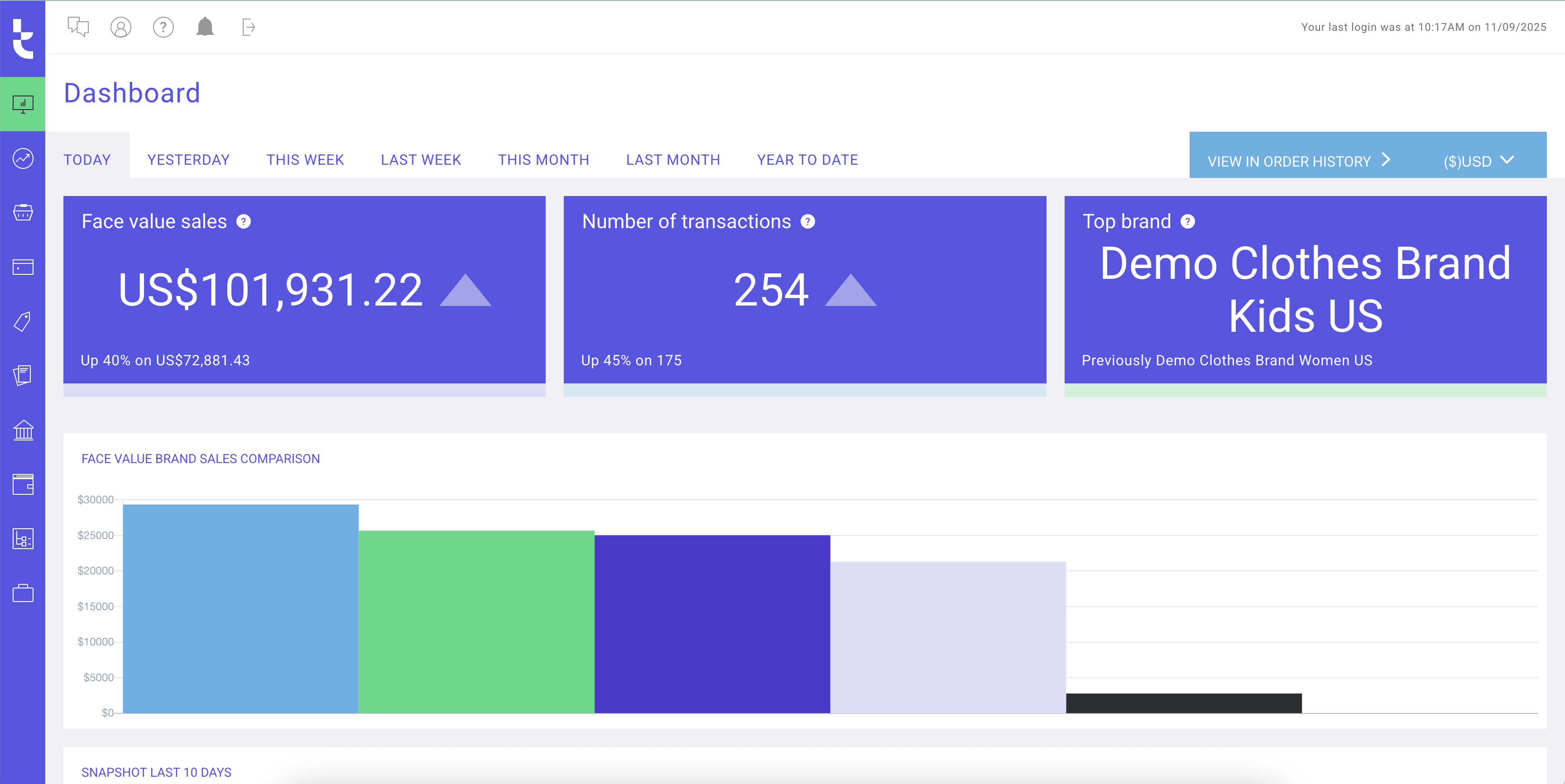
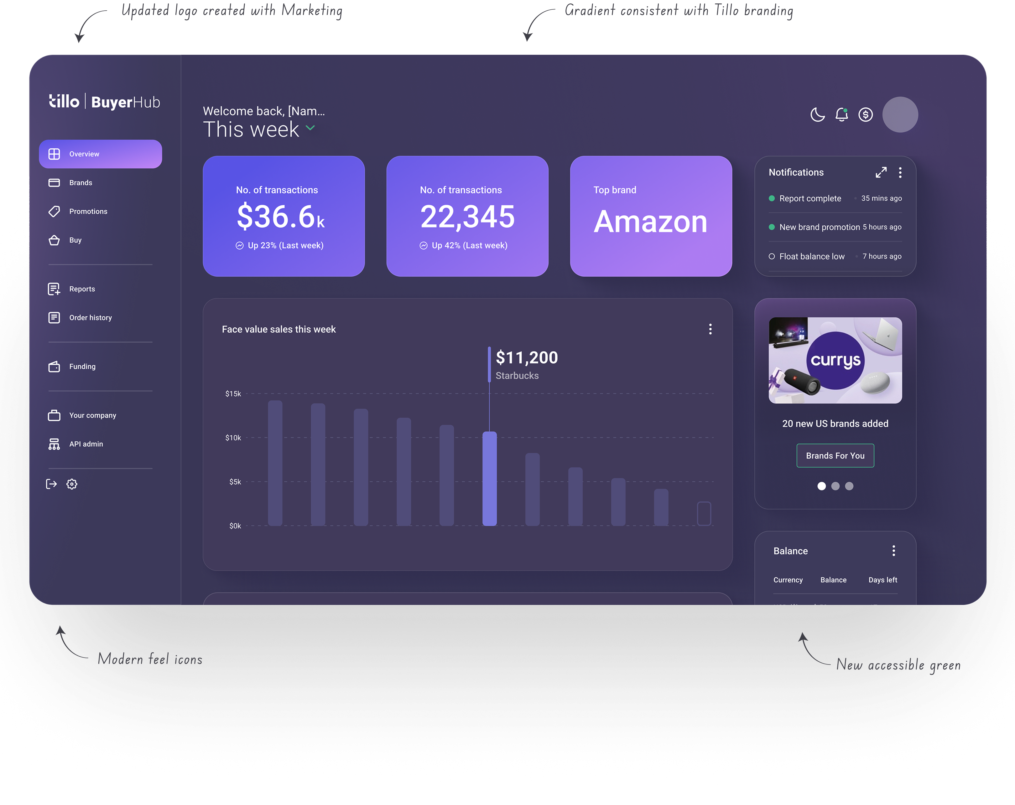
We began with the Buyer Hub, as it was the most widely used and would set the foundation for the remaining platforms. Starting with the dashboard allowed us to establish the overall visual direction and define core elements such as navigation, layout, and card styling.
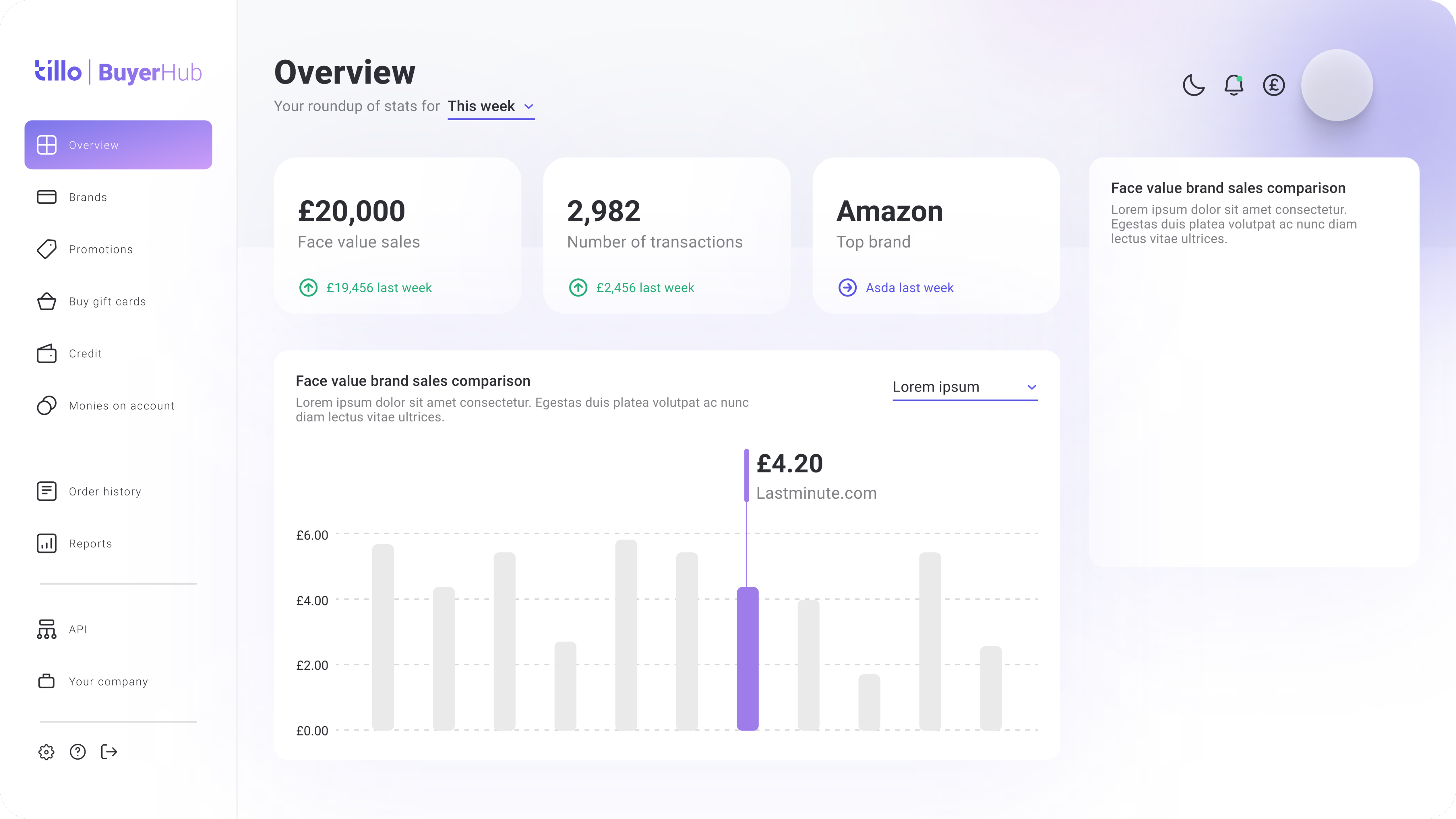
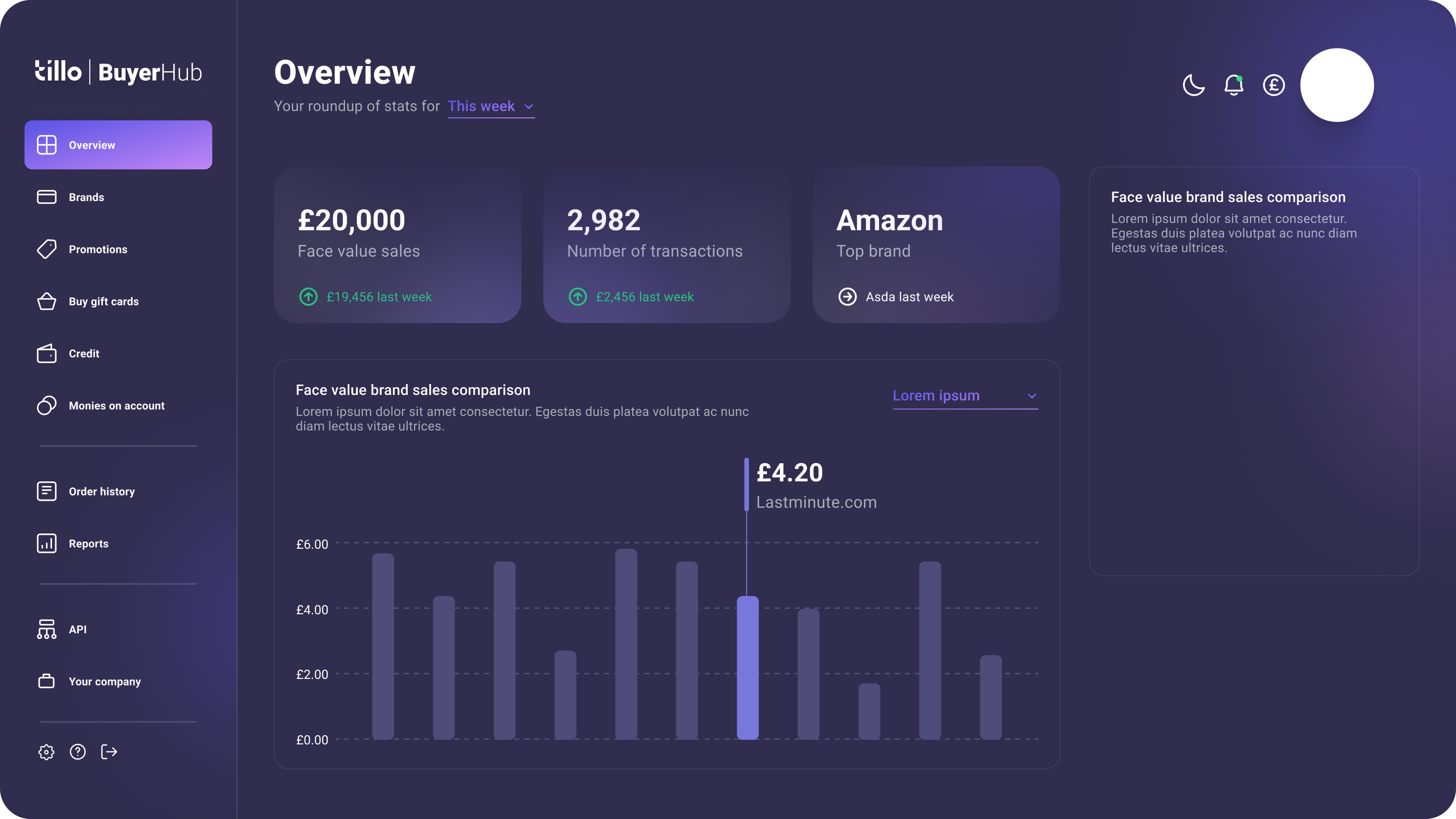
Dashboard ideas
Refining the visual direction
Early concepts were explored collaboratively with Marketing and Engineering to define the refreshed look and feel. This included introducing light and dark modes and updating brand colours to meet accessibility contrast requirements.
We developed a more accessible green to replace the existing brand colour, improving readability across hubs while keeping the brand recognisable.
Contrast 1.85:1
Product Emerald
#
39D884
Product Emerald
#
3AA67D
Contrast 3.03:1
Final UI
The refreshed UI applied the new visual direction consistently across key screens. Improvements to hierarchy, spacing, and contrast made the hubs easier to navigate, while keeping layouts familiar for existing users.
Light & dark mode
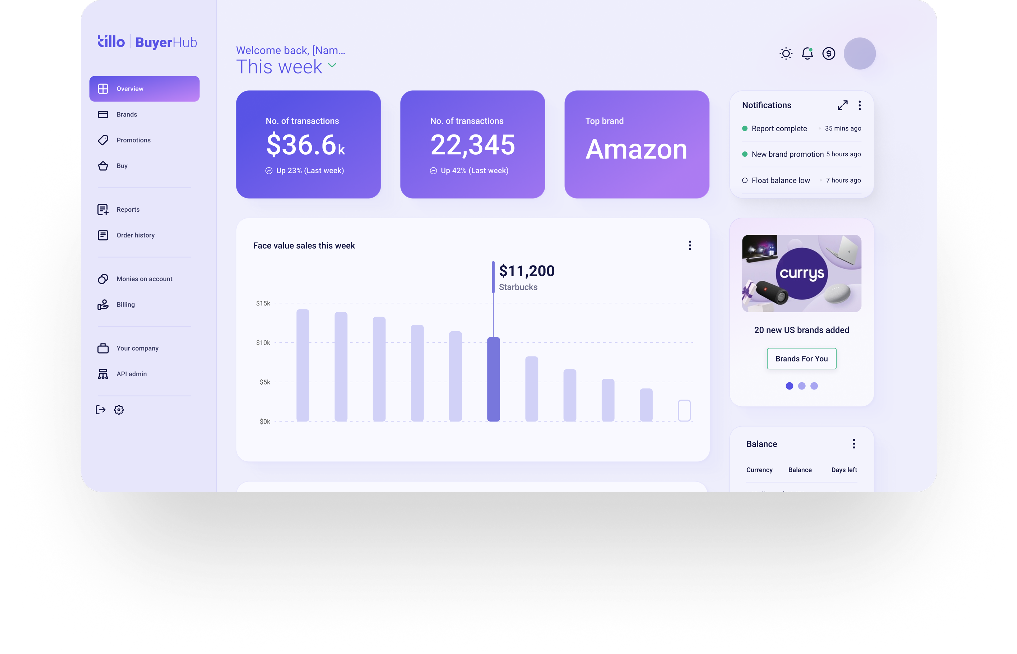
Dashboard page (dark & light mode)
Final screens
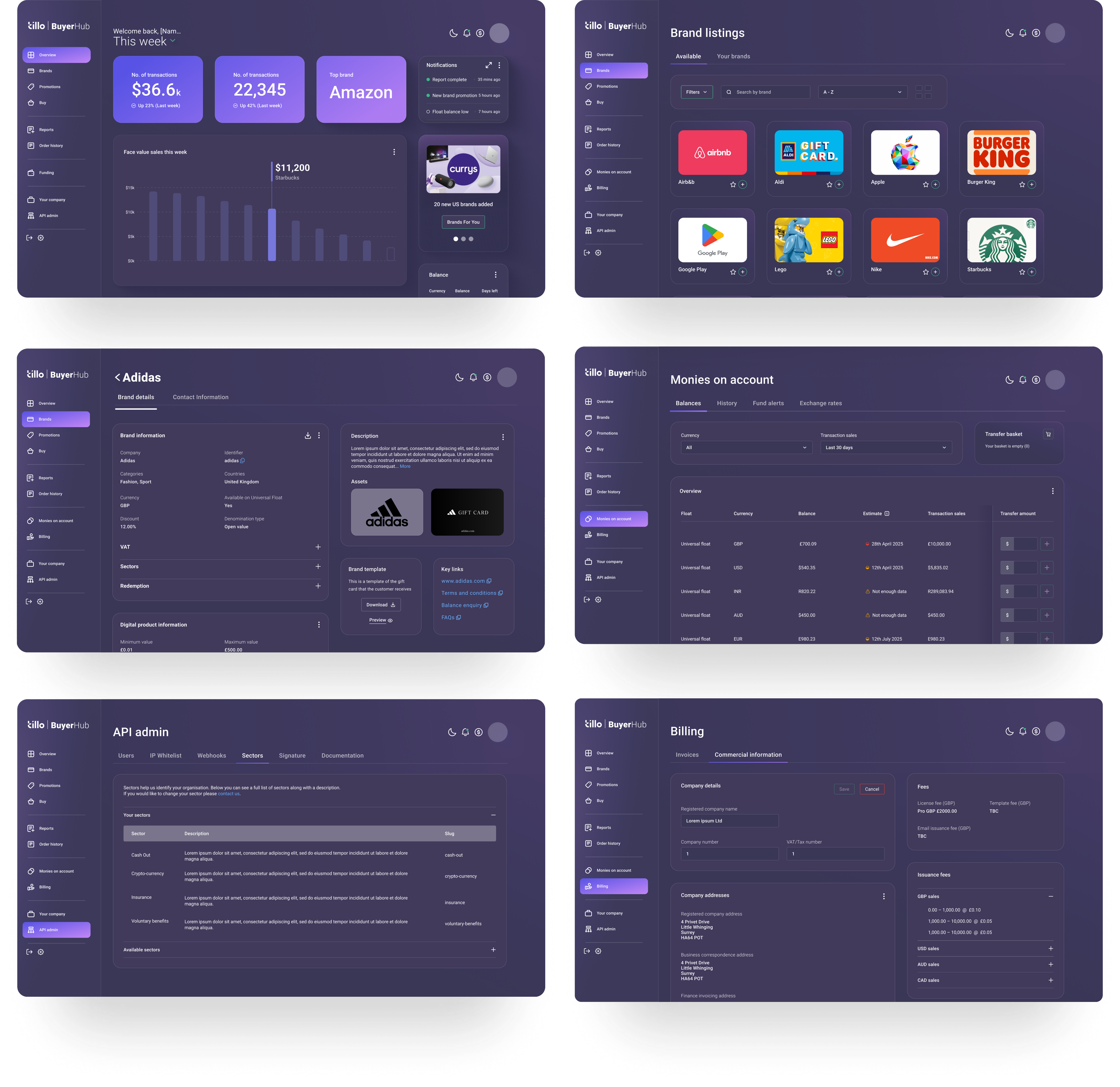
Final screens
UX improvements
Alongside the visual refresh, we introduced a number of small but meaningful UX improvements. These included:
- Sticky table columns so users can keep key info visible while scrolling large datasets.
- A new slide-in tray component that gives a quick snapshot of table entries (e.g. transaction details) without breaking context.
Table showing new sticky action column
Slide-in panel
Design system
We created Pavilion to document foundations and components in one place, giving Design and Engineering a shared source of truth. It includes tokens for colour, typography, spacing, and corner radii, alongside core components such as buttons, forms, and tables.
Having everything documented in one system made it easier to design and build consistently across hubs, and to scale the system for future products.
Components in practice
Key components were documented with clear usage guidance and states, including:
- Buttons & inputs with defined variants and interaction states
- Tables designed to handle complex data consistently
These components addressed some of the most common inconsistencies identified during the audit and were prioritised to maximise impact early.
Buttons
Tables
Tokens
Tokens replaced one-off values with a consistent scale shared across design and development.
Name

S Corner
M Corner
L Corner
Desktop

4
16
24
Mobile
4
16
24
Corner radii tokens
Collaboration
Alongside the design work, I coordinated two engineering teams working on separate hubs, chairing weekly meetings to align on implementation.
This helped ensure the design system was implemented consistently, rather than diverging again during build.
Impact & outcomes
This project changed how design and engineering teams worked together. Pavilion is now actively referenced during design reviews and development handover, helping teams align on patterns, reduce rework, and support accessibility across hubs.
For users interacting with multiple hubs, the refreshed UI also made navigation feel more familiar and predictable.
Learnings

Alignment
Creating the design system was only part of the challenge. Ensuring teams understood how and when to use components required clear documentation, regular alignment with Engineering, and reinforcement through reviews and snag lists.

Early validation
Early feedback sessions were useful for validation, but prioritising more structured user testing earlier would have strengthened some UX decisions.

Consistency
Designing for multiple hubs reinforced the importance of identifying shared patterns early and committing to them.
What’s next
Since launch, early user testing and behavioural analysis using Mouseflow have helped validate the refreshed experience and highlight areas for future UX improvement. Design continues to work closely with Engineering through a shared snag list to maintain quality and consistency as the platform evolves.
© Danni Whittaker 2026. All Rights Reserved.
Danni Whittaker.
Projects
Resume
Design system
Created a shared design system to improve consistency, accessibility, and delivery speed across Tillo’s customer hubs.
Project overview
Problem statement
Without a design system in place, Tillo’s customer hubs had grown inconsistent and outdated. Components were frequently duplicated, work was repeated, and the overall experience no longer reflected the updated Tillo brand.
Mission
The aim was to modernise the Tillo hubs, bring them in line with updated branding, and improve usability, while creating a design system that could support consistent and scalable future development.
My role
I owned key UI and system decisions, worked closely with Marketing and Engineering, and coordinated implementation across two engineering teams to ensure consistency during build.
Company
Tillo is a global platform that connects businesses with retailers, making it easy to buy, sell, and distribute digital gift cards.
Tools
FigJam, Figma, Miro, Mouseflow
Impact
4x faster
Faster design & development cycles, as reusable components reduced duplicated work.
Collaboration
Stronger team collaboration – daily/weekly syncs kept everyone aligned.
Improved UX
More intuitive flows, repeated design patterns and familiar interactions for users.
Consistent branding
Unified look across all Tillo customer touchpoints.
Background
Tillo’s customer hubs are B2B platforms used to manage orders, reporting, and cashflow. Over time, multiple hubs were built to support different customer types, including Buyers, Brands, and StoreFront clients. As these hubs evolved independently, the experience became fragmented for users who interacted across more than one platform.
Discovery & alignment
I carried out an audit of the existing hubs, which quickly revealed inconsistencies across buttons, tables, filters, layout patterns, etc. Similar elements behaved differently depending on the hub, increasing cognitive load for users and creating extra maintenance work for teams.
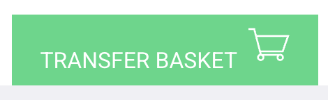
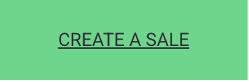
Inconsistent components
Buttons and tables were two of the most common problem areas. Variations in sizing, colour, states, and interaction patterns made the experience feel unpredictable and increased development overhead.
Edit button
Primary button
Accept/reject buttons
Branding misalignment
In parallel, I worked closely with Marketing to align the hubs with Tillo’s updated brand. We addressed inconsistencies in colour, typography, and tone that contributed to a dated look, while making sure the refreshed UI remained flexible enough to work across multiple hubs.
Tillo marketing website
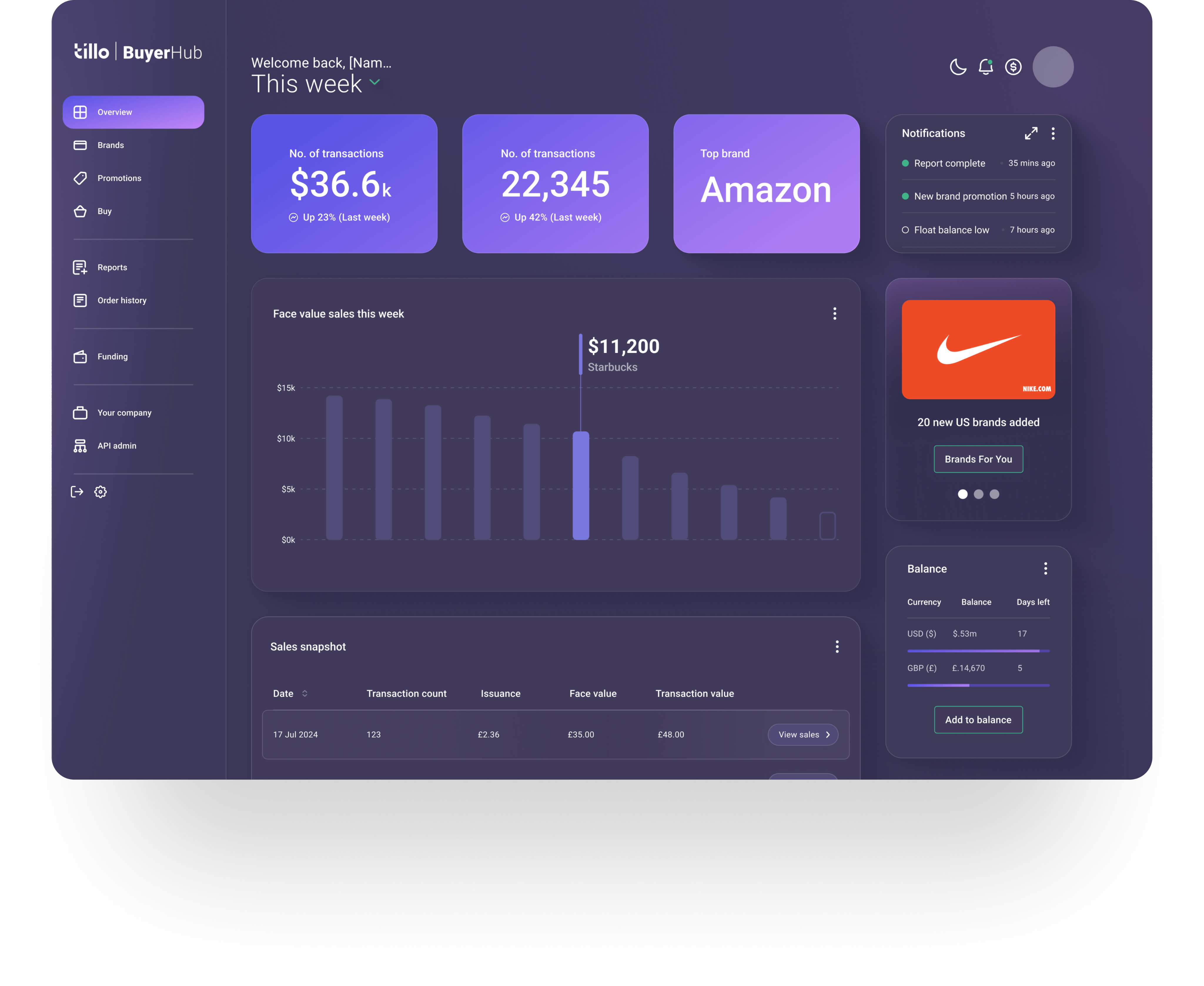
Tillo buyer hub
Exploring solutions
We explored two main approaches:
- A light visual refresh to align existing hubs with updated branding
- A full refresh introducing shared tokens, components, and patterns
While the lighter option offered faster visual consistency, it would not solve duplicated components or long-term scalability. I helped align stakeholders around the full refresh, as it addressed immediate UX issues and reduced the risk of repeated rework.
The solution
We moved forward with a full refresh supported by a design system, Pavilion, to fix immediate UX inconsistencies while creating a scalable foundation for future hubs.
Ideation
We began with the Buyer Hub, as it was the most widely used and would set the foundation for the remaining platforms. Starting with the dashboard allowed us to establish the overall visual direction and define core elements such as navigation, layout, and card styling.
Dashboard ideas
Refining the visual direction
Early concepts were explored collaboratively with Marketing and Engineering to define the refreshed look and feel. This included introducing light and dark modes and updating brand colours to meet accessibility contrast requirements.
We developed a more accessible green to replace the existing brand colour, improving readability across hubs while keeping the brand recognisable.
Contrast 1.85:1
Product Emerald
#
39D884
Product Emerald
#
3AA67D
Contrast 3.03:1
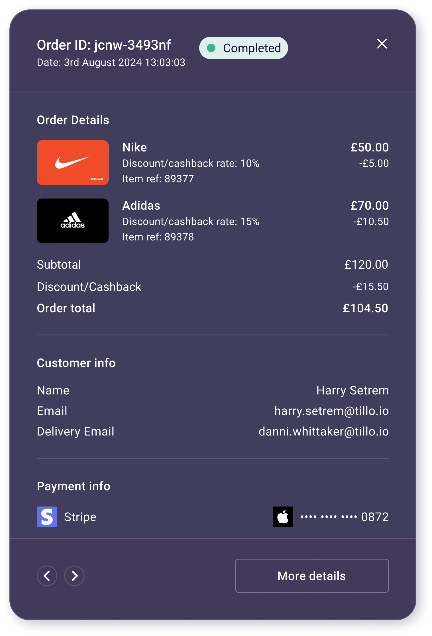
Final UI
The refreshed UI applied the new visual direction consistently across key screens. Improvements to hierarchy, spacing, and contrast made the hubs easier to navigate, while keeping layouts familiar for existing users.
Light & dark mode
Dashboard page (dark & light mode)
Final screens
Final screens
Final screens
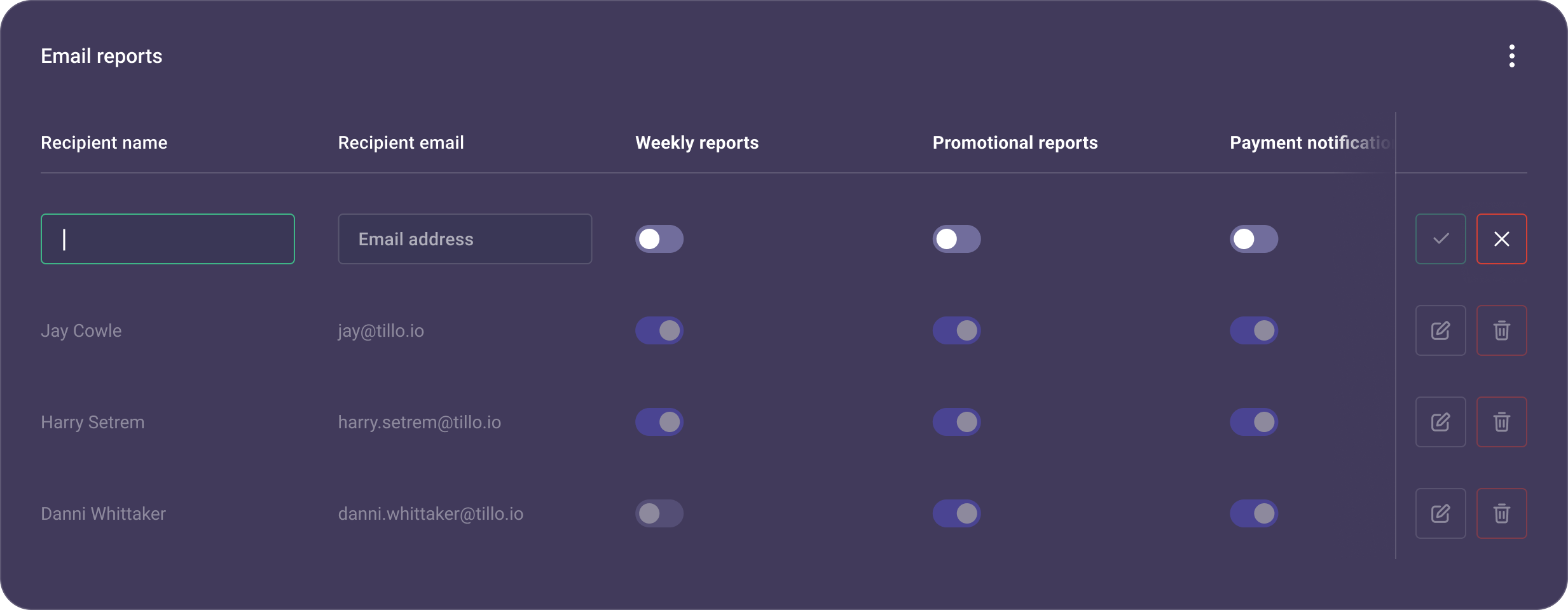
UX improvements
Alongside the visual refresh, we introduced a number of small but meaningful UX improvements. These included:
- Sticky table columns so users can keep key info visible while scrolling large datasets.
- A new slide-in tray component that gives a quick snapshot of table entries (e.g. transaction details) without breaking context.
Table showing new sticky action column
Slide-in panel
Design system
We created Pavilion to document foundations and components in one place, giving Design and Engineering a shared source of truth. It includes tokens for colour, typography, spacing, and corner radii, alongside core components such as buttons, forms, and tables.
Having everything documented in one system made it easier to design and build consistently across hubs, and to scale the system for future products.
Components in practice
Key components were documented with clear usage guidance and states, including:
- Buttons & inputs with defined variants and interaction states
- Tables designed to handle complex data consistently
These components addressed some of the most common inconsistencies identified during the audit and were prioritised to maximise impact early.
Buttons
Tables
Tokens
Tokens replaced one-off values with a consistent scale shared across design and development.
Name

S Corner
M Corner
L Corner
Desktop

4
16
24
Mobile
4
16
24
Corner radii tokens
Collaboration
Alongside the design work, I coordinated two engineering teams working on separate hubs, chairing weekly meetings to align on implementation.
This helped ensure the design system was implemented consistently, rather than diverging again during build.
Impact & outcomes
This project changed how design and engineering teams worked together. Pavilion is now actively referenced during design reviews and development handover, helping teams align on patterns, reduce rework, and support accessibility across hubs.
For users interacting with multiple hubs, the refreshed UI also made navigation feel more familiar and predictable.
Learnings
Alignment
Creating the design system was only part of the challenge. Ensuring teams understood how and when to use components required clear documentation, regular alignment with Engineering, and reinforcement through reviews and snag lists.
Early validation
Early feedback sessions were useful for validation, but prioritising more structured user testing earlier would have strengthened some UX decisions.
Consistency
Designing for multiple hubs reinforced the importance of identifying shared patterns early and committing to them.
What’s next
Since launch, early user testing and behavioural analysis using Mouseflow have helped validate the refreshed experience and highlight areas for future UX improvement. Design continues to work closely with Engineering through a shared snag list to maintain quality and consistency as the platform evolves.
© Danni Whittaker 2026. All Rights Reserved.
Danni Whittaker.
Projects
Resume
Design system
Created a shared design system to improve consistency, accessibility, and delivery speed across Tillo’s customer hubs.
Project overview
Problem statement
Without a design system in place, Tillo’s customer hubs had grown inconsistent and outdated. Components were frequently duplicated, work was repeated, and the overall experience no longer reflected the updated Tillo brand.
Mission
The aim was to modernise the Tillo hubs, bring them in line with updated branding, and improve usability, while creating a design system that could support consistent and scalable future development.
My role
I owned key UI and system decisions, worked closely with Marketing and Engineering, and coordinated implementation across two engineering teams to ensure consistency during build.
Company
Tillo is a global platform that connects businesses with retailers, making it easy to buy, sell, and distribute digital gift cards.
Tools
FigJam, Figma, Miro, Mouseflow
Impact
4x faster
Faster design & development cycles, as reusable components reduced duplicated work.
Collaboration
Stronger team collaboration – daily/weekly syncs kept everyone aligned.
Improved UX
More intuitive flows, repeated design patterns and familiar interactions for users.
Consistent branding
Unified look across all Tillo customer touchpoints.
Background
Tillo’s customer hubs are B2B platforms used to manage orders, reporting, and cashflow. Over time, multiple hubs were built to support different customer types, including Buyers, Brands, and StoreFront clients. As these hubs evolved independently, the experience became fragmented for users who interacted across more than one platform.
Discovery & alignment
I carried out an audit of the existing hubs, which quickly revealed inconsistencies across buttons, tables, filters, layout patterns, etc. Similar elements behaved differently depending on the hub, increasing cognitive load for users and creating extra maintenance work for teams.
Inconsistent components
Buttons and tables were two of the most common problem areas. Variations in sizing, colour, states, and interaction patterns made the experience feel unpredictable and increased development overhead.
Edit button
Primary button
Accept/reject buttons
Branding misalignment
In parallel, I worked closely with Marketing to align the hubs with Tillo’s updated brand. We addressed inconsistencies in colour, typography, and tone that contributed to a dated look, while making sure the refreshed UI remained flexible enough to work across multiple hubs.
Tillo marketing website
Tillo buyer hub
Exploring solutions
We explored two main approaches:
- A light visual refresh to align existing hubs with updated branding
- A full refresh introducing shared tokens, components, and patterns
While the lighter option offered faster visual consistency, it would not solve duplicated components or long-term scalability. I helped align stakeholders around the full refresh, as it addressed immediate UX issues and reduced the risk of repeated rework.

The solution
We moved forward with a full refresh supported by a design system, Pavilion, to fix immediate UX inconsistencies while creating a scalable foundation for future hubs.
Ideation
We began with the Buyer Hub, as it was the most widely used and would set the foundation for the remaining platforms. Starting with the dashboard allowed us to establish the overall visual direction and define core elements such as navigation, layout, and card styling.
Dashboard ideas
Refining the visual direction
Early concepts were explored collaboratively with Marketing and Engineering to define the refreshed look and feel. This included introducing light and dark modes and updating brand colours to meet accessibility contrast requirements.
We developed a more accessible green to replace the existing brand colour, improving readability across hubs while keeping the brand recognisable.
Original Emerald
#
39D884
Contrast 1.85:1
Product Emerald
#
3AA67D
Contrast 3.03:1
Final UI
The refreshed UI applied the new visual direction consistently across key screens. Improvements to hierarchy, spacing, and contrast made the hubs easier to navigate, while keeping layouts familiar for existing users.
Light & dark mode
Dashboard page (dark & light mode)
Final screens
Final screens
UX improvements
Alongside the visual refresh, we introduced a number of small but meaningful UX improvements. These included:
- Sticky table columns so users can keep key info visible while scrolling large datasets.
- A new slide-in tray component that gives a quick snapshot of table entries (e.g. transaction details) without breaking context.
Table showing new sticky action column
Slide-in panel
Design system
We created Pavilion to document foundations and components in one place, giving Design and Engineering a shared source of truth. It includes tokens for colour, typography, spacing, and corner radii, alongside core components such as buttons, forms, and tables.
Having everything documented in one system made it easier to design and build consistently across hubs, and to scale the system for future products.
Components in practice
Key components were documented with clear usage guidance and states, including:
- Buttons & inputs with defined variants and interaction states
- Tables designed to handle complex data consistently
These components addressed some of the most common inconsistencies identified during the audit and were prioritised to maximise impact early.
Buttons
Tables
Tokens
Tokens replaced one-off values with a consistent scale shared across design and development.
Name

S Corner
M Corner
L Corner
Desktop

4
16
24
Mobile
4
16
24
Corner radii tokens
Collaboration
Alongside the design work, I coordinated two engineering teams working on separate hubs, chairing weekly meetings to align on implementation.
This helped ensure the design system was implemented consistently, rather than diverging again during build.
Impact & outcomes
This project changed how design and engineering teams worked together. Pavilion is now actively referenced during design reviews and development handover, helping teams align on patterns, reduce rework, and support accessibility across hubs.
For users interacting with multiple hubs, the refreshed UI also made navigation feel more familiar and predictable.
Learnings

Alignment
Creating the design system was only part of the challenge. Ensuring teams understood how and when to use components required clear documentation, regular alignment with Engineering, and reinforcement through reviews and snag lists.

Early validation
Early feedback sessions were useful for validation, but prioritising more structured user testing earlier would have strengthened some UX decisions.

Consistency
Designing for multiple hubs reinforced the importance of identifying shared patterns early and committing to them.
What’s next
Since launch, early user testing and behavioural analysis using Mouseflow have helped validate the refreshed experience and highlight areas for future UX improvement. Design continues to work closely with Engineering through a shared snag list to maintain quality and consistency as the platform evolves.
© Danni Whittaker 2026. All Rights Reserved.